

Seems I'm a bit hyper-focused on chairs these days. Recent posts about clutter and tomatoes, (of all things), featured chairs and here we go again...
 This ladder back chair has lived with me for almost twenty years. It was purchased two homes ago to act as the desk chair in my then freshly remodelled kitchen. It's a late-80's antique repro of sorts. It is not really very special and was certainly not expensive. But it is well-built and it has worked hard. At desks, in two kitchens, in one bedroom, as an extra at the dining table and now, it resides in my entryway. It collects handbags and mail and is the "on deck" spot for all things ready to leave the house, including not-so-patient children. It assists with shoe tying, light bulb changing, grocery toting and occasionally serves as a cat bed. It has never not been up to the assigned task. Considering all this, I suppose my ladder back is pretty special after all.
 Looking at it one day in all its basic brown-ness, I decided it deserved a treat. A "thank you". A happy-color face-lift. There is, after all, enough brown in this house what with all the oak and walnut on the floors and most of the furniture. A pretty, friendly color just inside the front door might be a more pleasant way to greet guests. Something like one of the examples above from Maine Cottage Furniture. These Edna chairs are modeling four of MCF's standard colors: Moss, Sun, Spruce and Celadon. After lots of thought and looking around my house for color inspiration, this is where I started to narrow my choices.
I was pretty sure I wanted a blueish-green, but I entertained the idea of yellow for a moment as there is a lot of golden yellow in both the living and dining spaces that can be seen from the entry. (The panel above, via countrycurtains.com, will stand in for the golden checks in my living room) But yellow, I decided, would be too bold, jump out at me too much as I entered the front door. The color should be quieter. I wanted it to say "Hi! This is a fun, happy house" without looking like it came from an actual funhouse.

So green with a hint of blue it would be. A jadeite sort of green. I would mix the paint to match one of the bowls in my kitchen. Out from the storage shed came pots of paint in all the various hues and shades I thought I needed in order to achieve my ideal color. I mixed and mixed, and along the way, decided I liked a little more blue in my green. So I mixed and mixed and came up with a color I loved. I began to paint. The more I painted, the more I loved it. My chair was looking happier with each stroke of my blue-green brush. And it looked great there in my kitchen surrounded by all the other vintage greens and yellows. Over the course of two days, I brushed two full coats on every surface of my chair. When it was dry enough to touch, I carefully lifted it by its finials and tippy-toed it out to the entry. And knew immediately that I had made a terrible, too-bright, aqua-blue mistake.
 Not that I have anything against aqua. But seeing my chair in its place by my front door made me think of these interiors, above, by Maine designer Tracey Rapisardi. I love her work. But everything about her work that is so good—bright, clean, beachy colors—is all wrong for my house where the colors are more muted, aged, "dirtier" as Maria might say. Especially in my entry and living room, where the light is lower and softer than in my kitchen, my new minty-fresh ladder back stuck out like a sore thumb. See for yourself. This photo, below, is the only one I can bring myself to show you. Oh sure, it's a pretty color. But wrong, wrong, wrong in this space. I should have tested the color in the room at some point instead of forging ahead and assuming that, because I loved it, it would look right. That's what I get for being in a hurry.
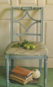
 So back to the paint pots I went. Pour, pour. Mix, mix. Add a little bit of yellow to the base green this time. A little bit of brown too. And not quite so much blue. Using a piece of kitchen pottery that is more sage than jadeite as a guide, I came up with a new green that, in the kitchen, looks almost grey and very pale. But out in the entry... we have a winner!
Not that I have anything against aqua. But seeing my chair in its place by my front door made me think of these interiors, above, by Maine designer Tracey Rapisardi. I love her work. But everything about her work that is so good—bright, clean, beachy colors—is all wrong for my house where the colors are more muted, aged, "dirtier" as Maria might say. Especially in my entry and living room, where the light is lower and softer than in my kitchen, my new minty-fresh ladder back stuck out like a sore thumb. See for yourself. This photo, below, is the only one I can bring myself to show you. Oh sure, it's a pretty color. But wrong, wrong, wrong in this space. I should have tested the color in the room at some point instead of forging ahead and assuming that, because I loved it, it would look right. That's what I get for being in a hurry. So back to the paint pots I went. Pour, pour. Mix, mix. Add a little bit of yellow to the base green this time. A little bit of brown too. And not quite so much blue. Using a piece of kitchen pottery that is more sage than jadeite as a guide, I came up with a new green that, in the kitchen, looks almost grey and very pale. But out in the entry... we have a winner! The color is something between the original jadeite I was looking for and the aqua that turned out to be a mistake. It's softer and quiet and a little earthy. It says "Hi! Can I take your bag?" without shouting. In the pic below, you can see how the green works with the colors in the living room as you peek over the back of the sofa. Green is a minor element in this space, but there is a lot of it in the adjoining kitchen and dining areas. A little green in this room adds continuity to the overall look of my home's decor.
 Now, if you think this is an awful lot to say about one chair and one color decision, you should read Maria's latest post over at Colour Me Happy. Maria writes about the decisions and actions that take place when designing and ordering the fabrication of a single custom pillow. It's a lot like the process I went through to decide on the color of this chair. Although, if I'd sent the chair to a painter rather than painting it myself here at home, it would have been a much longer process—not to mention more expensive due to my poor first choice. Every interior design project is like that. A string of decisions sets in motion any number of actions. Each action requires its own record and review and approval before the next action can be taken. Multiply this by however many elements are changing in your space: flooring, wall color, sofa, chair, table, a lamp or two, rugs, pillows. . . and so on until your room is complete. It's a lot of work, even when you've been specially trained to do it, even when you have a lot of experience, and especially if any mistakes are made along the way. But the hard work pays off when you end up with something like my prettier, happier green chair.
Image of jadeite dinnerware via thepioneerwoman.com, Tracey Rapisardi interiors via bhg.com. See more of her work at searosedesigns.com


12 comments:
Well done....you definitely made the right decision with your final colour! I think it's fun to mix paint, one of my favorites in a design class I took!
Have a great day!
Great visual point! While both colors look great on the chair on their own, you realized that the earthier colors looked better for YOU. I am impressed when people mix their own colors and it comes out not looking like mud. Enjoy your refreshed chair!
Very impressed with your color mixing abilities! I do love it much better green than stained. I know what you mean about liking those brighter, cleaner colors and then realizing they don't work in your home. :-(
it looks perfect!!!! awesome jon mizing!! (love your pillows too! ;)
What a beautiful green, and such a tough color to get right. You scored a perfect hit.
Hey, thanks for the shout!! And I also loved your, "It says, Hi Can I take your bag?" without shouting!!
You are so funny!! (love the chair by the way)
xo
Maria
It's good to know that I'm not the only one who puts herself through so much to get it just right. I can torture myself over the smallest detail and I'm not even a professional like yourself. I think your chair looks perfect. And I love the pillows on your sofa. Decorating truly is a labor of love.
Janet
Love what you got going on here!
It is a happy green chair, one I would be delghting to let watch my bag!
Don't you just love eating off jadeite???
Hi Tracy,
Crate & Barrel has gorgeous flatware and I thought it was reasonably priced! They had a hammered one that I loved and others equally as stunning! I love your green chairs by the way!
Love the green of the chair. I have shelves painted the same green.
Oh, thank you so much for sharing this. Much as I love to read about successful makeovers on blogs (as this of course turned out to be), it gives me such courage to know that it's not always plain sailing and I'm not the only one who gets it wrong! The whole concept of clean/dirty colors makes a lot of sense to me.
Post a Comment