Monday, June 29, 2009

No! Not that kind of vice!


Shelter magazines. Friends and family will agree, they're my vice of choice. An incurable habit. The thing I spend so much time and money on, I don't even want to think about how much time and money it would all add up to. But, see, there's this: I don't smoke anything. I don't drink much of anything. (Although, if you hand me a margarita, I will drink it. And the next one. And the next one. So it's a good thing I don't live in a Mexican restaurant.) I don't own too many shoes. I don't collect coats or expensive handbags. What I do own, hoard, subscribe to in embarrassing numbers are shelter magazines. Not surprising I suppose, considering my current profession. They're actually a necessity. Now. But this vice? This addiction? It goes way back. Before design school. Before home-ownership. Back to when Architectural Digest was a to-the-trade publication. What are my favorites, you ask? (I'm pretty sure I heard someone ask) Well, let's see. Until a few months ago, I would have said my all-time personal fave was Cottage Living.

Thanks to my hoarding tendencies, I have every issue!

But this crazy economy has caused too many great magazines, like that relatively new one, to close.* Not enough people spending their money on home decor and improvements to support the advertisers who supported the publishers. So even more senior, well-respected industry favorites like Domino, Country Home, House & Garden, and Home are gone now too.


Two kind of quirky titles I purchased at the newsstand more times than not, Mary Engelbreit's Home Companion and Martha Stewart's younger, hipper spin-off Blueprint, were a lot of fun but they too are no more.


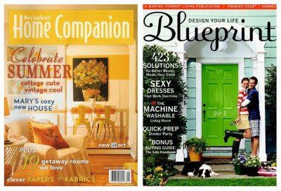
Yes, some of my favorites remain. Veranda, Elle Decor, California Home+Design and Southern Accents top that list.

And I wouldn't know what to do without the range of inspiration I find in Traditional Home, House Beautiful, Metropolitan Home and Western Interiors.


Recently, I even crossed the border and found a couple of fine replacements for some of what was lost. They're doing the job quite nicely too.

One each from Canada and the U.K.


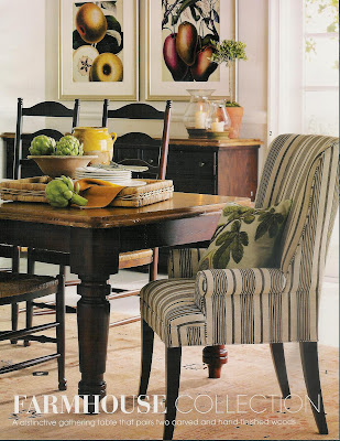
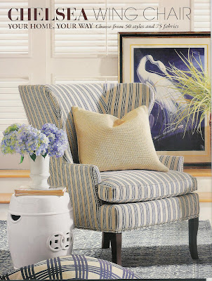
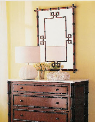
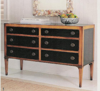
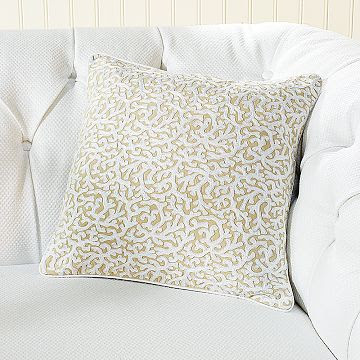
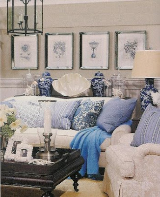
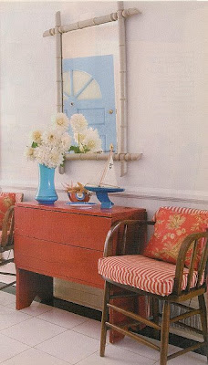
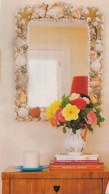
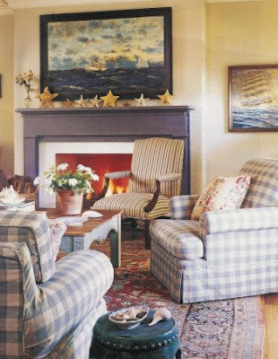
But the one I'm most grateful for, the one I've read continuously since high school, is still going strong. Better Homes & Gardens. Thank goodness (and Meredith Publications) it's remained so popular. Ok, maybe not "popular" like a celebrity or the homecoming queen. It's not known for being the most stylish or artful or cutting-edge. But it's real. And it's comfortable. Like your oldest and dearest friend who would never make you feel dumb for not knowing what a fauteuil** is. Reading BH&G doesn't feel as much like homework as some of the other titles I use for research and inspiration. Even so, since the closure of so many, this magazine has really stepped it up design-wise. Take a look at these images from recent issues:


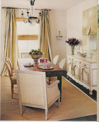
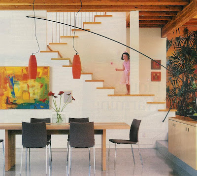
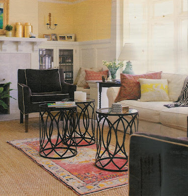
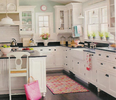
Pretty great, right? I think so. And where else can you find inspired decorating, region-appropriate gardening guidelines, parenting advice, health and beauty tips and ten recipes for potato salad all in the same issue? I don't know. I don't need to know. Because I have my old friend BH&G. And all of her little sister "special interest" publications like "Decorating" and "Beautiful Interiors". Curled up on the sofa with a stack of BH&G's to page through feels the same to me as watching a favorite old movie for the fifteenth time. Cozy, comfy, reassuring, familiar. So I guess I'll call this old friend my "new" favorite.


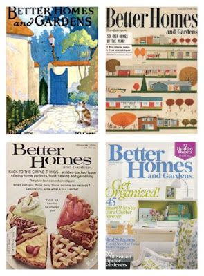
Left to right, top to bottom: covers from 1926, 1958, 1973 and 2009


Tubbs and Crockett image from my own personal stash of memorabilia. (kidding)

*If you are a design blogger or have been reading design blogs for more than a few months, you know that the subject of "dead magazines" has been discussed everywhere by everyone. But I'm new here. And I'm still not completely over the fact that I won't find the current issue of Domino or Country Home or Cottage Living (!) in my mail box this week. Or ever. And that makes me sad. So give me a break. Thanks.

** A fauteuil is a fancy French armchair of the Louis XVI era, very similar to the more commonly familiar bergere but much more difficult to pronounce. Five different vowels in one eight-letter word?!

NOTE: After writing and scheduling this post, I learned that Western Interiors was also closed a couple of months ago. Bummer. But no longer shocking. Also a bummer.

Saturday, June 27, 2009

In my mailbox


A new Williams-Sonoma Home catalog arrived this week. I love everything about this full-page pic of their Farmhouse Collection. (below) I've always liked the collected look of upholstered host chairs with completely different wood side chairs and these ticking striped wingbacks are quite nice. A little small in scale perhaps next to that chunky farm table and tall ladder-back chairs, but I'm okay with that. Not everyone has the space for a big fat armchair at the head of the table so this is a way to get a similar look without over-stuffing the room. The large botanicals over the sideboard are a dramatic take on a traditional look. The vegetable-dyed Peshawar rug adds beautiful, subtle warmth and texture with a minimum of pattern. The remaining accessories here support the Italian countryside look that's been so popular of late. Like I said, I love every bit of it.


Also in a ticking stripe, the Chelsea wing chair is a staple of Williams-Sonoma's upholstered furniture collection. She's available in many fabrics, leathers, and your choice of polished nickle or antique brass nailheads. Blue ticking is so perfect for Summer decorating and this chair would be appropriate whether your look is farmhouse, like the previous pic, beach house, or as part of a more eclectic mix as shown here in the catalog.


More pretty. A mirror from the Hampstead Bedroom Collection. No rules would be broken though if you chose to use it in an entry, a dining room or even over your bathroom vanity. Solid woods are turned and finished to mimic bamboo. Nicely proportioned and I love the criss-cross corners. However, I'd prefer to see it paired with something not so "matchy" as this dresser from the same collection. It should be allowed to stand on its own.


A beautiful dresser that might just steal the show from any mirror hung over it is this one from the Capri Collection. Solid cherry and tulip woods are stained and hand-rubbed. The pretty tapered legs, antiqued brass pulls and other nice details give it the look of a piece you might have inherited from a fashionable aunt. That it could easily move from bedroom to dining room to entry hall makes it a worthwhile investment.


Finally, here's my attempt to stand up for coral. Love it or hate it, there certainly has been a lot of it around. In reds, oranges, deep blues and aquas for the most part. This embroidered pillow, (reminiscent of Waverly's classic coral prints, don't you think?), in white wool chain-stitch on khaki-colored cotton, brings a little bit of beach to your home without a hint of garishness or kitsch. At $79.99, (reduced from $118), it's an affordable way to add this trend to your decor without breaking the bank. Or looking too trendy. And because it's more subtle than it's boldly patterned and brightly colored counterparts, it will play well with the pillows you already have and you could almost certainly keep it around into the fall. Then bring it out again next year to get another Summer's-worth of under-the-sea style.


All images via wshome.com and catalog

Wednesday, June 24, 2009

It's a doggy-dog world


In editor-speak and word-geek world, that is what's known as a "malapropism"; the act or habit of ridiculously misusing similar sounding words without bothering to consider their literal meaning. Do you know someone who swears Elton John is singing "...hold me closer, Tony Danza" even though the song's title is "Tiny Dancer"? (please don't tell me if it's you!) Even my super-smart daughter, at elementary school assemblies, would sing the song "America" in her own special way. She'd start out fine with "My country tis of thee...", but those last emphatic words in the first stanza, "Let freedom ring!", she heard as "...every dumb ring". So that's how she sang it. It didn't make any sense at all but neither does the rest of that song to most seven-year-olds.


The malapropism "It's a doggy-dog world" is a happy-sounding misinterpretation of the quite pessimistic saying "It's a dog-eat-dog world", an idiom that describes a world in which people fight only for themselves and are likely to hurt other people in the process. In business especially, it refers to the ruthless seeking out of one's own advancement no matter the expense to others. It's a life where staying ahead of the competition is much more important than how you got there.
These attitudes may have something to do with the predicament too many Americans find themselves in these days. In always striving to get more, to quickly climb the corporate ladder and stay one step ahead of the Joneses, many overextended and overestimated their abilities to remain in that world where conspicuous consumption and unprecedented returns on investments ruled. We've all been affected by our country's economic downturn in some way or another and continue to watch almost daily as unemployment, foreclosures and lost fortunes make headline news.


It might have been wise to keep in mind the words of actor, director and apparent crank, Orson Welles who said

"Living in the lap of luxury isn't bad, except that you never know when luxury is going to stand up."


A sound warning I suppose if by "lap of luxury" he meant, as is most commonly understood, always having the best of everything money can buy. Not that I wouldn't want to try that for a while. And as a designer/decorator, I like to think I know a little something about the finer things in life and how to go about acquiring them if one is so inclined. But that's not the only definition of luxury I choose to live with in my own life.


True luxury, to me, is having people in your life to love and who love you back. Having a place you're proud to call your own whether it's 800 sq ft or 8,000. Luxury is having so many choices of yummy foods to eat that you're always just a little bit over-weight. Luxury is surrounding yourself with pretty, meaningful things, even if they're not fine antiques or designer originals, and having lots and lots of books to read. It's being able to choose to play hooky from work today because you have enough money in the bank and a secure job. And having the time to take a walk just for the pleasure of it and not because you don't have any other way to get around. I don't mean to over-simplify, but I do think it's important, when times are tough for any reason, to be able to take a step back and try to be more grateful for what you have than dissatisfied by what you don't.


If these ideas of mine about the luxuries that are really important in life sound anything like your own, then welcome to my doggy-dog world! Where there's always something to be happy about even if it's just a cozy place to curl up at the end of an exhausting day spent chasing your own tail.


Images top to bottom:

"Dona Francisca Vicenta Chollet y Caballero" by Francisco Goya y Lucientes, 1806, from the collections at the Norton Simon Museum

Vintage Russian postcard, origin unknown

"Lap Dog", contemporary woodcut print by Stephen Huneck

Detail of vintage photograph via Antique Dog Photos on Flickr

Paris and her props, I mean pups, from all over the internet

"Portrait of a Lady with a Lap Dog" by Rembrandt Harmensz van Rijn, c. 1665

Bob and Katey the malapropism-prone singer, c. 2001

Monday, June 22, 2009

A rose is a rose...


June's flower is the Rose. I couldn't have asked for an easier way to begin this series of posts. Roses are everywhere. Outdoors, indoors, in gardens, on fabric, in art. The yellow rose you see here grew in my own garden. I believe it's called St. Patrick. I received this rosebush several years ago as a Mother's Day gift. Or was it my birthday? They're usually so close together, I get mixed up. This photo is the same one I cropped and overexposed and used as the first banner for my blog. So this particular rose means a lot to me.

Roses mean a lot to almost everyone it would seem. We send bouquets of them to celebrate, congratulate and commemorate births, deaths, anniversaries, even a fantastic first date. They decorate cakes, are carried by brides and adorn our bodies from birth to old age. In Victorian times, flowers were ascribed very specific meanings and used as symbolic gestures in order to communicate without words. (Oh, those wacky, uptight Victorians!) Roses, in all their great variety, maintain those same meanings today. We all know that red roses symbolize passionate love and romance and that yellow roses connote warmth and friendship. White roses are traditional for wedding bouquets because of their association with innocence and purity. Did you know though that lavender roses mean "love at first sight"? And if you received such a rose from a new admirer, would you respond with a pale peach rose for "modesty" or the deep coral rose of "desire"? I suppose it would depend on who signed the card attached to that lavender rose.

As I will do with each successive "Flower of the Month" post, I present for you here images of this month's flower used in art, decor, fashion, architecture... wherever I happen to find them. And remember when I said this post couldn't be easier? Well, that's not exactly true. Because rose motifs really are everywhere. On every conceivable surface and material, composed using every imaginable medium. But we only have so much time and there isn't nearly enough space in this one place to show you all that I found, much less all that there are. So here is my very modest (can I get a peach rose, please?), brutally edited offering:


Found a few weeks ago at my favorite used book store in Ventura Beach; 168 Redoute' colorplates, suitable for framing


Art Deco-inspired wild roses in ceramic from earthsong tiles


William Morris Rose Trellis wallpaper circa 1862


West rose window of the Washington National Cathedral, dedicated in 1976


Waverly's classic Vintage Rose fabric has been everywhere on everything

A modern "vintage" print on a tote by Cath Kidston


Contemporary, stylized roses on upholstery fabric from Calico Corners


A pretty, ultra-feminine dress from Kate Spade's Spring collection


Could anyone even begin to count the roses that appear each year at the Kentucky Derby?


We've all seen this singular rose, behind the parade, each New Year's Day: the Tournament of Roses logo on the wall of the Norton Simon Museum in Pasadena, California


The ubiquitous Old Country Roses by Royal Albert


A beautiful union of traditional and modern in a bridal bouquet


Rosey toes for your baby


And, finally, something special just for mom


Next month: Larkspur. Hmm. Do you think anyone's ever tattooed themselves with larkspur? I'll take a look around...

Friday, June 19, 2009

Comfort Food Friday


Because this Sunday is Father's Day, I present a favorite comfort food that is not mine, but my husband's. He grew up on the East Coast. Massachusetts to be precise. But for thirty years now he's lived here on the West Coast. Still pahks his cah in the yahd though. And still loves loves loves fresh New England-style seafoods. Most of all, long-neck steamers. Hard to find here, but the clam of choice if you grew up there. Or so I'm told.


Now, you might say "yum!", but I say "yuck!". Clams belong in a chowder. Swimming in a creamy, buttery broth with a few potatoes. That's as far as I'm gonna go with clams. But my clam-loving husband goes all the way. To Maine. It's become something of a Father's Day tradition. No, he doesn't actually go to Maine, but his steamers do come from there. By FedEx. With a couple of lobsters to keep them company. And their journey's not over when they arrive on our doorstep. The very next day, they'll take a drive down the coast to my father-in-law's house. He's lived here for a few years now too. Together, father and son will steam a big pot of freshly-delivered seafood, bake a couple of potatoes, divvy up some crusty bread and dig in. More than a few cold beers will be employed to wash it all down. It will be a good day.

What food from your childhood or faraway hometown is your favorite?

Top image is Swan River Seafood in Dennisport, Cape Cod, MA. Looks like our kind of place, though we haven't been there. Yet. Bottom image via Flickr. Long-necks and lobsters are ordered from mainelobsterdirect.com

Friday, June 12, 2009

Bath Blues


This guest bath is scheduled for a mini-makeover. Not too much but just enough to make a difference. Check back in a few weeks.

Monday, June 8, 2009

Beach Season


It may have started for you on Memorial Day weekend. For families with young children, it starts when the final bell rings on the last day of school. The calendar tells us it begins on June 21st this year, the same Sunday as Father's Day. Summer. Time to lighten up. Live a little. Take it outside. And, if you feel so inclined, time to bring some of that outside in.

Here, three of my favorite designers show us how to bring the beach to indoor spaces. All are based in Southern California but each has his or her own signature style. So whether you like your summer big and loud and bright, or warm and relaxing, enjoy!

Barclay Butera. His interiors are glamorous, luxurious and a little over-the-top. His shoreline designs feature classic, familiar details used in dramatic fashion: blue and white textiles, tropical plants and patterns, seashells and coral, woven grasses on the floors, the furniture and at the windows. Chinese porcelains add to the collected, eclectic look while dark woods paired with white walls or fabrics lend a British Colonial air.


Lynn von Kersting. Her Hollywood clientele might be chic and rich and famous--she founded both the iconic restaurant The Ivy and Indigo Seas, the home furnishings and accessories store next door--but von Kersting's interiors are comfortable, accessible, colorful, cozy and, quite often, a little bit beachy. Her California cottage look incorporates lots of layers, patterns, and an intriguing combination of French, Asian and West Indian influences. Fine antiques mingle freely with flea market finds.


Michael S. Smith. Beautiful, traditional interiors with an English influence are his trademark. Carefully edited collections of antiques and art are expected elements. He has designed beach house interiors in Malibu, the Hamptons and Cape Cod. Two luxury West Coast hotels, Shutters on the Beach in Santa Monica and Canary Hotel in Santa Barbara, boast his designs in both guest rooms and public spaces. Smith interiors are elegant and timeless yet completely approachable and livable.


Beach umbrella image via Flickr.