 Two small photos of the kitchen, in the official Showcase program, were the only ones I was allowed to take away from my tour of the estate and grounds. No photography permitted. As two simply weren't adequate to tell the story, I wasn't even going to try. Until I snooped around online and found lots of "unofficial" photos of the Cravens Estate including plenty of the kitchen. You'll remember that the Cravens Estate is the home used for this year's Pasadena Showcase House for the Arts in Pasadena, CA.
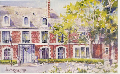
 And let me remind you too that the house itself is an imposing 50-room mansion built in 1930 to resemble the baroque Chateau de Vaux-le-Vicomte, the 17th century French chateau that was also an inspiration for the palace at Versailles. Since 1962, the estate has been headquarters for a local chapter of the American Red Cross—that's why you see a cross pattern laid into the brick drive in front of the house. The home's original owners, John and Mildred Cravens, never had children so they lived in this nearly 20,000 square foot home all alone. With their 32 servants. (Do you realize that at a total of 34, that still isn't enough people to fill the house at one person per room?)
 The clean-lined, glass-front cabinets wore their original crystal knobs and a coat of lifeless white paint that had seen better days. The same can be said for the slim wood counter tops and simple white tile backsplash. Both seem almost painfully plain compared to the grandeur found in other parts of the home, but in the 1920's and 30's, kitchens were for work, used by staff, not the homeowners, and certainly not on display for guests as our kitchens are today.
 Clearly, the Red Cross staff and volunteers who have worked in the house for the past 48 years have been using the kitchen as a strictly utilitarian area much like the original estate staff would have. Not one thing in the space is purely decorative. The only splashes of color are found in the bulletins taped to the walls and fridge and on that lovely blue bag of paper plates. In the photo above, you can see the original cut-out drawers that were preserved in the makeover. The designer calls her approach to the kitchen renovation "not just a face-lift, but an actual restoration".
 The Pasadena-based company responsible for this space spent three months on the job, working hard to preserve as much of the original kitchen cabinetry, floor tile and other materials as possible—including the silver safe, above. In the finished kitchen, the "safe" became a small supplemental pantry. According to what I've read, there are two other, original pantries somewhere nearby that weren't part of the show house makeover.
Here's another look at the full kitchen "before". The doorway you see at the back under the clock leads to an interior hall that in turn leads to a family/media room to the right and the main dining room to the left. To the immediate left of the photographer's position is a door leading to an outdoor terrace. Another indication that this is an old-fashioned working kitchen are the few and rather small windows. You can see one over the sink on the left wall in this view. The "after" of that window is the top pic on this post. Behind the photographer is a pair of similar small windows, and the door to the terrace holds its original leaded glass. That's it for natural light. Very different from the way a kitchen would be designed today. Now, here's the "after", from the same angle:
 Quite a dramatic difference, wouldn't you say? Let's start our tour at the bottom and work our way up. The original tile floor in a classic brick basketweave pattern is spectacular. The most perfectly variegated shades of turquoise. On the Showcase website, it is said that the designer was thrilled to find such a bright surprise hidden under layers of grime and built-up cleaning products. From this vibrant shade was born the room's copper, teal, white, turquoise and brown color scheme. Most of the lower cabinets were stripped and stained a warm dark brown to match the restored wood counter tops. All of the glass-front upper cabinets were restored. Most are painted white. One set, near the door to the hall is finished to match the lowers beneath it, creating the look of a tall hutch.
 Other counters and the new island are topped with copper-colored Metalcrete, fabricated to look like hammered copper, and pale, stain-resistant Nucrete, a concrete-based material made from 50% recycled products. In fact, all of the products used in this kitchen restoration are considered in some way "green". Anything new in the kitchen is made from sustainable and eco-friendly materials. And, of course, recycling the existing flooring and cabinetry is as green as green gets. In the photo above, you can see all the shades of the color scheme. I especially like the brick-colored upholstery on the fat counter stools that tuck under the island. They contrast beautifully with the turquoise floor and relate to the home's brick facade that can be glimpsed through the window over the sink. Notice too that the window valances are that same brick color.
 All of the new appliances are energy-efficient. The refrigerator and dishwasher are disguised behind dark cabinetry or in the island, respectively. You can see the tall fridge enclosure in the two photos above. It serves to visually divide the long room into work area and storage/display area. The range wall was made a focal point with the addition of a top to bottom tile backsplash and extra-large copper hood. Copper pots and canisters continue that part of the color scheme and serve to obscure some of the expanse of wall tile. Standing in the room, looking at this view, I was torn trying to decide whether the green retro tile pattern was a good fit with the turquoise floor tile. My first impression was "wow, that's a lot of pattern!", but the longer I look at these pics, the less it bothers me. The wall tile lends a dose of light and softness, even a bit of "sparkle", with its starburst pattern, to the hard surfaces in this end of the room. And the more-green-than-blue color, rather than competing with the turquoise floor actually complements it. What do you think? It's a strong look that's definitely not for everyone.
So that's the first kitchen. What do you think? Good? Bad? Your style? Not? Next post, I'll show you the second kitchen. The photo above gives you a look at what we'll see on the way...
Photos found at artsbeatla.com, cindydole.com, dailynews.com, insidesocal.com and pasadenastarnews.com




 The daisy, birth flower for the month of April, has long been celebrated in art and poetry for its simple beauty. Poets like Chaucer, Phoebe Cary and James Montgomery used the flower to symbolically express devotion. Hairpins decorated with daisies have been found in ancient ruins dating back 4,000 years. A European native, the daisy is widely naturalized in North and South America. While its most recognizable form—white petals and a golden yellow center with grassy-green stem and leaves—belongs to the family "Bellis perennis", its common name comes from the term "day's eye," a reference to the fact that daisy blooms are only open during the day and close up at night.
  There is a myth that tells of the daisy's creation when a nymph transformed herself into a charming but unassuming wildflower to escape unwanted attention. Through the centuries, daisies came to be associated with innocence, childlike joy and playfulness. No other flower captures the essence of spring’s happy-go-lucky, forever-young attitude like the daisy. Daisies have long been associated with love. The "she loves me, she loves me not" method of pulling petals from a flower was first used with the daisy to tell love's fortune. Daisies are customarily given in bouquets to new mothers as a way to celebrate the birth of their baby. Did you, as a child, make "daisy chains" to wear on your wrists and in your hair?



 For Earth Day, a little green house that seems to grow right out of the ground. A vine-covered metal framework in the classic shape of every child's first drawing of home, this small structure is in the
 Inside the green house is a table and benches scaled just right for children (or small leafy bears) where they can relax in the cool shade created by the creeping fig vines covering the walls and roof. High up in the rafters is a succulent ball chandelier. See how it echoes the shape of the round windows at the roof's peak? Good design is important, even in a house of wire and vines.


 There are so many home and garden events happening in this area over the next month or so, it will be nearly impossible to take them all in. Besides the small, neighborhood events like the one I just mentioned, there are larger more elaborate goings-on, some of which are
  I already have my tickets for the annual Pasadena Showcase House which opened today and runs through May 16. This is the 46th Showcase to benefit arts programs in and around Los Angeles. The historic, chateau-inspired Cravens Estate, built in 1929, has been given a makeover inside and out by 25+ local interior designers and landscapers. You can view their progress and get ticket information
  Closer to home, from April 30-May 2, the Los Angeles County Arboretum and Botanic Garden will hold its annual LA Garden Show. This show focuses on green living in Southern California offering workshops, lectures and demonstrations on such things as edible gardens and water-wise plant choices. (


 Let me tell you a story... A few years ago I attended a series of classes at a local college, refresher courses if you will, as I prepared to re-enter this field. One of them was a basic overview of interior design principles and techniques that I used as an opportunity to pick up the tools and get the juices flowing again. For one assignment, our instructor divided us into groups of three. Each team was given a program—the objectives and goals of a specific space and client—and was asked to use the resources in the classroom to design a concept board.
 We live in a world of limitless paint color choices. Every conceivable hue, tint, shade and tone is out there somewhere. And if you haven't the time to search for just what you think you want, custom color mixing is as close as your nearest home-improvement store. There will, however be only one sofa that you fall madly in love with. One hand-scraped, reclaimed hardwood that you must have as your kitchen floor. One, and only one area rug that makes your antique dining set sing.
 Most new homeowners will rush to paint all the rooms before moving in. "Toasty Taupe in the living room!". "Cloudless Sky in the bedroom!". It seems to make sense. Painting while the rooms are empty. But choosing paint colors without first knowing what you'll put into those rooms could be a big mistake. Adding other elements after paint could cause a clash of undertones. Now the paint looks too pink, too yellow, too gray. What seemed like the perfect fresh green for your living room walls might look dirty or dull after you bring in your new sofa. Even if you don't plan to buy a whole room full of new furnishings right away, know what you will buy when you can buy and base your paint choices on that. Or base your paint color on an element in the room you know won't change: your heirloom chair or a cherished piece of art.

