Friday, October 30, 2009

Marigolds and Oranges


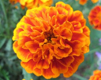
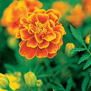
OCTOBER'S BIRTH FLOWER IS THE MARIGOLD
Their rich, autumn-colored hues make marigolds very appropriate for this time of year. As with most flowers, meanings ascribed to them vary among cultures and time periods. Early Christians called marigolds Mary’s Gold, and placed them by statues of the Virgin Mary. The Welsh believed that if marigolds were not open early in the morning, a storm was on the way. In the complex Victorian language of flowers, marigolds were appointed the flowers of grief and despair. Once considered the most sacred of flowers in India, garlands of marigolds were placed around the necks of holy statues.


Other sources say the marigold, also called calendula, signifies affection and grace. And some have called it "summer bride" or "husbandman's dial" because its flower head follows the sun as it moves across the sky. Also appropriate for the season, the marigold appears to have healing, even magical, powers. Fresh petals can be used to relieve the pain of a bee sting and a thrifty skin cleanser can be made from dried petals mixed with almond oil and fragrant rose or orange blossom water. Some cultures have used marigolds as love charms and a water made from marigolds was believed to induce visions of fairies when rubbed on the eyelids. Others thought that marigold flowers added to the stuffing of a pillow would encourage prophetic or psychic dreams.


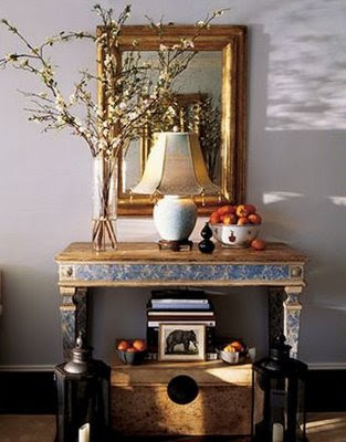
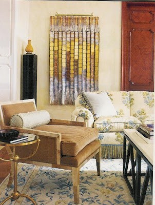
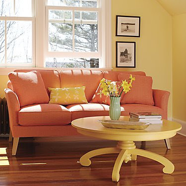
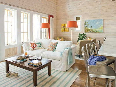
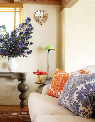
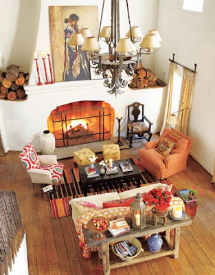
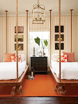
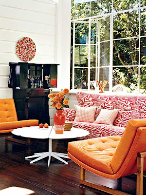
Meaningful and magical as these late-harvest flowers can be, we don't often think of marigolds when building a bouquet—though this one, above, is actually quite charming. Equally charming is the effect the warm, orange color of the marigold can have on our interiors. And while the color orange may not suit every taste, used in small doses or large, it does add a spark, a warmth, and an element of surprise that suits many styles.


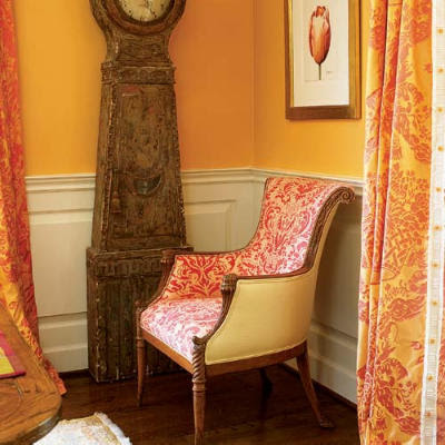
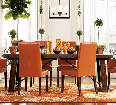
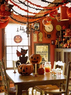
If you do love orange,
and your dining room walls happen to already be painted that color,
it isn't difficult to imagine that you might also enjoy decorating for one of our most fun-filled fall celebrations. The following images were borrowed from Decor Village.

HAVE A HAPPY
HALLOWEEN !!!

Wednesday, October 28, 2009

Unexpected Warmth


No, I'm not complaining about the too warm weather again. But, for the record, it is finally beginning to cool enough here to believe that it really is fall. Rather, this post is about the unexpected warmth that can be found in a blue room. Most often, we think of blue interiors in terms of crispy cool blue and white beach houses, watery blue bathrooms, little boy's bedrooms and very traditional spaces along the lines of this


and this.


But use less vibrant though still cool blues and substitute creams for the bright whites above and right away you get a warmer look like this


and this, below. Still light and wide open like the best beach houses, but a bit warmer and a little cozier. Notice too the references to fall in the photo below: a gourd on a shelf, rustic basket on the table, and an arrangement or golden-hued flowers. Sometimes it's the smallest details that make the big difference.


Bring back the vibrant blues of the first two photos but balance them with warm woods, creams and tan on walls and fabrics and lots of layered accessories and textures and you can have your blues and cozy too. Warmer still.


Warmest of all, the following spaces feature ample doses of gold and orange on floors, walls and ceilings. Textural fabrics like wool, velvet and chenille are warm to both the eye and hand.


There are warm blues, of course, but more often it seems the temperature of the blue used in a room is less important than the colors used around it. Set off by bright whites, pastels or citrus shades, blue takes on the perceived coolness of swimming pools and oceans. In other spaces, the blues below might appear icy and cold, but here, because of the other elements in the rooms, the overall look warms up.


The room below, by the incomparable Phoebe Howard, may be my favorite blue room ever. Notice how prominent the blue wall is. A periwinkle shade that could read very cool if treated differently, becomes a beautiful counterpoint to all the browns and golds and dusky greens. Texture is also important here. Warmth is found in weathered woods, glinting gold on picture frames, carved and patinaed accessories, the fireplace mantel, the velvety fabrics.


The image at the top of this post is an entry vignette by designer Jeffrey Bilhuber. Everything about it says warmth and welcome.
Countless studies have confirmed that blue is America's favorite color. I imagine that's in some part because true blues are happy, energizing and very familiar. Blue is, after all, the color of the sky and water we see all around us every day. Familiar is also comfortable. And much comfort can be found in a warm, blue room.

DON'T FORGET: I'm hosting Mood Board Monday this time! Go to this post to see the inspiration items and get your mood board ready for the McLinky party on Monday, November 9th. Go to Room Remix, where PK started Mood Board Mondays, to see all the creative results of the last challenge. Please come play with us! No competition—just fun.

Monday, October 26, 2009

Mood Board Monday... Come Play!

PK at Room Remix has asked me to choose the inspiration pieces for her next Mood Board Monday McLinky party. Obsessed with chairs as I am, I couldn't help but choose these two beauties from Anthropologie. Click on the pics to go to their source.

Bertram


Antwerp

Both chairs have leggy profiles and are upholstered in fabrics with dark backgrounds. One, however, has clean, contemporary lines and is dressed in mixed-up menswear stripes while the other boasts brightly-colored paisley and suzani embroidery on a classic, curvy French bergere frame. Even the backs of the chairs have their own unique designs.


I love tham both and have no idea which one I'll end up using. I hope you like them too and I can't wait to see all the creative ways they're put to use. By the way, if you use Polyvore to create your mood boards, Bertram and Antwerp are already there, listed by name.

This Mood Board Monday is scheduled for November 9th. Mark your calendar and get ready to show your work. Thanks to PK for asking me to host the party here too.

As a reminder, here are the "rules"... otherwise known as "guidelines":

1) This is NOT a mood board competition for designers (although designers are certainly welcome to participate). This IS a fun way to share all of the creativity out there, and showcase how we can all start from one inspiration point and end up with a variety of ideas.
2) To be a participant, you need to create a complete mood board for a room of your choice using at least one of the two inspiration items shown here.

3) On MBM party day, you will need to include sources in your post and give a brief description of the room and how you used the inspiation item(s).

Now, go get "designery" and we'll see you back here on the 9th!

Thursday, October 22, 2009

Flowery Favorites


Searching through my photo files, I found these two images that had inadvertently been saved side by side—the room very recently, the flowers well over a year ago.


This bit of serendipity confirms what I'm most attracted to: multiple strong colors used together, always with a pop of red, and a neutral base that not only grounds the lively colors and gives them something to show off against, but provides a place for the eye to rest. Additionally, both the flowers and the room feel casual, friendly, open and optimistic—no stuffiness or formality of any sort. My favorite kind of flowers and my favorite kind of room. Where comfort is every bit as important as style.And this is proof too, in a backward sort of way, that the color scheme of a room can be inspired by anything that attracts you: from a favorite fabric or pillow or rug to a piece of art or a floral arrangement.

The room is in one of my favorite homes published this year: Hemlock Springs, Southern Living's Georgia Idea House. If you didn't see it in their August issue, use this link to take a look. The whole house is just as pretty as this one room.

Tuesday, October 20, 2009

If I Ruled the World. . .


. . . it might look a lot like Waverly's world.


Their current print ads make me smile every time I see one. So I thought I would share them with you... in case you don't stumble into the same kind of color and pattern, fabric fanatic craziness I often find myself in the middle of.


Wouldn't you love to live in a neighborhood where the mailboxes look like this:


Having been a fan of Waverly's fabrics and products for many years, I'm so glad to see them freshening up their image. Yet reassured that many of my favorite traditional looks are still their mainstay. Like these from the Romantic Overtures Collection:

Ballad Bouquet in Robins Egg

Damask Duet in Mushroom

One of my favorite new-ish patterns is Chantel. I can see it on traditional upholstered armchairs as well as more contemporary slipper chairs. First though I'd have to decide which of these colorways is my favorite:

Brique

Vapeur

Chocolate

Dore


I purchased a remnant of Saison de Printemps in Creme some time ago, having no idea what I might do with it. I'll most likely use it somewhere in my kitchen.

Here's the same pattern in Saffron. Oh so French country.


If I weren't so determined to get rid of all the wallpaper in my house, I might be tempted to use one of these:

Essence in Spa


Damask in Cinnabar


Waverly is a terrific, affordable source for traditional styles in fabrics, wallpapers, paints and other home decor goods, many of which are available at chain retailers like JoAnn and Lowes. Check out their website to get a look at their product line.

And don't be fooled into thinking that traditional means stuffy or stodgy. There's a freshness to many of their current styles and, depending upon the end use, even the most traditional colors and patterns can look new and chic.

Headboards by Eugenia Erskine Jesberg via katiedid upholstered in Waverly fabric.