Monday, August 31, 2009

China Pattern


A common thread wove its way through my weekend. A pattern of Asian-influenced design, colors and flavors.

It began on Friday evening when I attended a lovely gathering at the home of good friends. Our hostess prepared the most delicious, beautifully colorful meal of Chinese chicken salad and potstickers with a perfectly sweet and spicy dipping sauce. I wish I had photos to show you. Trust me, it was as pretty to look at as it was scrumptious to eat!

Next, I did some early fall-weather shopping and found this gorgeous jacket. It's called, appropriately, 'Chinoiserie', and I'm told the fabric is patterned after an antique textile discovered by the designer on her travels through Europe. I can't wait to wear it! We'll have to get through these hotter-than-hot late summer days first.


Saturday brought this elegant Asian vignette, from the blog Room Service-Decorating 101. I love the simplicity of the arrangement and quiet colors. I kept this image in my mind all weekend. It's so calm and soothing... the perfect pretend place to wander off to in the middle of a hectic day.


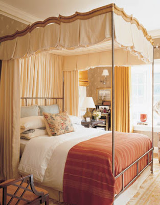
Also on Saturday, I was paging through the new (last!!) issue of Southern Accents, and spied the lovely photo at the top of this post. Inspired by the story on blue and white export porcelains, I created a new grouping, tucked into a bookcase, of three of my own blue and white pieces.


Sunday morning, I flipped on the TV to keep me company while doing chores, and there was Ina Garten on the Food Network grilling up the most beautiful tuna steaks. Chopped into bite-sized pieces, the tuna was mixed with avocado chunks and topped with a dressing of soy sauce, lime juice, scallions, red onions, wasabi powder and toasted sesame seeds. Ina piled the tuna mixture high on a bed of arugula and wrapped it all up in a toasted bun. More Asian goodness!

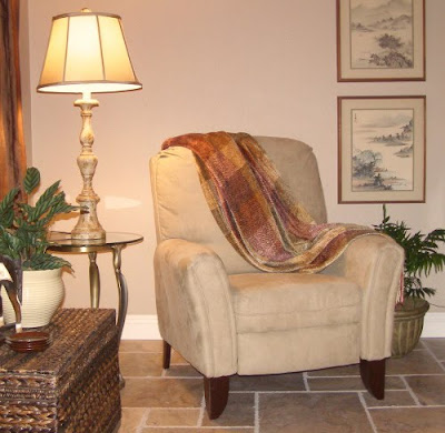
Later, while searching my photo files for something else entirely, I came upon these shots of a job I did last year for a client that was inspired by her own collection of Asian elements. This first photo shows a corner of her living room that includes two watercolors her father brought home from China many years ago. He served a good deal of his time as a military pilot travelling throughout Asia, collecting souvenirs to take back home all along the way. The subtle colors in these paintings paired well with the new stone flooring and the neutral taupes and golds and greyed olives of the furnishings and accessories the homeowner and I selected.


The other side of the living room features a large hand-painted silk screen that had been tucked away in a bedroom for years. The photo below doesn't do it justice, so I've included a second pic showing a detail of one corner. I was so excited when she showed it to me, I practically insisted we use it. Hung over the sofa now, it is flanked by the new, Asian-inspired carvings I found. The clients were very pleased to have another of their family heirlooms take center stage.


From the entry, you can see the entire living room. In the foreground, a box with carved Chinese characters on top and brass fittings, also from her father's travels, sits on an antique chest that belonged to the husband's grandmother. The carved wooden horse is one the clients already owned, the smaller Tang-style horse figure I purchased to go with it.


In the dining room, I continued the Asian theme in a more subtle way by layering three re-sized table runners across the width of the table. The combination of colors and textures and layering gives the impression of a Japanese obi. This was one of my first jobs when I started my design business in 2008. There are other images, most without the strong Asian elements seen here, I'll share with you another time.


So that was my Asian-influenced weekend! Funny how the theme kept repeating itself. Oh, and I almost forgot... for lunch on Sunday, I picked up some fresh, brown-rice California rolls. Yum! And guess what my husband decided to cook up for dinner that same night... grilled teriyaki chicken skewers, sticky rice and garlicky green beans! I hope you had an equally interesting, and delicious weekend too!!

Saturday, August 29, 2009

You Say Tomato, I Say "Have a Seat!"


Here's something far more interesting than a post about actual tomatoes...

For your viewing pleasure and contemplation: The Tomato Chair.

According to stardust.com, website of the Sonoma, CA modern home furnishings retailer, "The Tomato Chair is a flexible, fun, and funky way to sit in style. In a rainbow of colors these chairs will not only brighten up your room, they'll brighten up your day." Maybe so. But if my husband found out I'd spent $885 for a tomato (and that's the current 'on sale' price), my day would definitely darken!

Silly as they seem, if I could hang out in a scene like this, next to a cool pool on a grassy lawn and get away from this 100+ degree weather we're having, I'd gladly sit on a tomato.

Friday, August 28, 2009

Comfort Food Friday


Fresh vine-ripened tomatoes. Grown in my own backyard. One of my favorite summer foods. But not this year. The remaining days of summer are few and I have become acutely aware that I missed out on one of the season's best treats. Because I didn't plant my tomatoes. Got too "busy" and let planting time pass me by.


So there were no lush vines heavy with tiny grape tomatoes warming in the sun, begging to be eaten by the handful. No Big Boys or Early Girls ready and waiting to grace an impromptu BLT. No Romas ripening faster than we can use them on fat, shrubby plants.


Last year's garden yielded all of that and more. Beautiful, bright, juicy tomatoes that became the main ingredients for salads and salsas and sandwiches. One day in late summer, we picked every single ripened fruit--our last harvest--brought them into the house, washed them up and super-chef husband turned them into a great big batch of marinara. Of course, we ate some fresh that night. The rest was frozen in batches and used over the next several months in all sorts of yummy, savory recipes.


No last-harvest marinara this year though. Or fresh pico de gallo chopped up in a jiffy because company's coming.


I think this weekend I'll make a stop at the farmers market and pick up a selection of someone else's homegrown tomatoes to turn into something yummy like this:


a cheesy tomato tart,


a light tomato linguine,


fried green tomatoes (that I will eat by myself because I still can't get super-chef to give them a try),


or maybe this delicious looking ham and tomato pie. Recipes for all of these fresh tomato dishes, including the pico and at least a dozen more, can be found at southernliving.com. I'll be sad that I'm not cooking with my very own, but I know the farm-grown tomatoes will be every bit as good. Just not as special. I won't let this happen again next year!

What's your favorite summer comfort food?
And did you get your fill?


Farmers market photo via sunset.com
Recipe photos via southernliving.com
Others either taken by me or borrowed from an unknown source

Wednesday, August 26, 2009

Do You Let Sleeping Dogs (or Cats) Lie?


. . .on your bed?

getty images

photo by peggyvverybusy via Flickr

photo by heather via Flickr
crazyauntpurl.com

via timesunion.com

photo by veganmichele via Flickr

getty images


Catnap interrupted. Kitty on Katey's bed.


A very uncomfortable (but obedient) Bob on Katey's bed where she posed him for a sketch. His natural, preferred habitat is wherever dirt and leaves and little sticks that cling to his coat can be found in our backyard. We should have named him Pigpen.


So I was just wondering. Do you or don't you?


Up top, American artist Andrew Wyeth's 1965 watercolor, "Master Bedroom"

Sunday, August 23, 2009

Comfort and Luxury Bedroom Style


As long as we're on the subject of bedrooms, I thought you might be interested in what some of our favorite designers have to say about these very personal spaces and the design elements they use to fill these rooms with comfort and luxury...

According to Michael S. Smith in his book "Elements of Style", a bedroom should be designed primarily for sleeping, relaxing and escaping from the rush and noise of the day. The room should be calm and the bed comfortable. And what some might call luxuries, Smith calls essentials: fresh flowers, a good reading light, art you love, a fireplace, shelves for books, a concealed sound system, television and DVD player, curtains or shutters adequate to managing light and "wonderfully comfortable chairs". If that sounds like a lot to you, the designer admittedly agrees and adds that a bedroom should also be "a room that's magical to sleep in; it should not be cluttered or over-designed". It is his ability to bring all of this to one beautiful, perfectly-designed yet personal, livable room after another that makes Smith the master designer he is. See two of his classic designs below, and more in the pretty details above.


As I mentioned in my last post, one of my favorite bits of bedroom decor advice comes from the incredible Charlotte Moss. Known for her feminine spaces, she was asked in an interview for Southern Accents magazine how she maintains her signature "feminine look without being cloying or alienating men, especially in the master bedroom?" To which Moss reiterated advice she has given before: "Trying to appeal to both, you could end up with a master bedroom that's nowhere rather than one that speaks to the lady of the house. Men don't want to admit it, but they want to feel like they are being invited into the bedroom. You don't want a master that is a navy pinstripe. It should be all about the lady of the house." This philosophy is illustrated beautifully by the work she did for a showhouse in Kips Bay, New York (see the two photos below). Moss imagined her homeowners as a couple who met in Rome, married in the hills of Tuscany and then blended the beauty and history of the Italian countryside with the urban style of their new life together in Manhattan. If you haven't already seen the rest of Ms Moss' fabulous showhouse pied-a-terre, I strongly urge you to go here. It's all just so beautiful, it shouldn't be missed.


In a House Beautiful article from November 2008 called "The Secret of Comfort is Quiet Luxury", Texas designer Ginger Barber designed a master bedroom for clients with teenage children. The space is feminine and private, but like the rest of the home, designed with family and comfort in mind. Faded and worn-looking textures and patterns on natural fiber fabrics, jute, hotel-grade and well-worn antique carpets, large-scale furnishings and soft, warm colors make every room in the beautiful house less formal and more livable than it might have been in the hands of a different designer. And yet, as thoroughly used and family-friendly as the house is, it is also, in Barber's own words, "very done". The master bedroom, below, with its rose-printed Bennison fabric, plaid taffeta bedskirt, baroque mirror, soft carpeting and linen upholstery, is, like the article's title, both comfortable and luxurious.


The caramel cocoon below was designed by Harry Heissmann who is currently establishing his own design firm after nine years working with the legendary Albert Hadley. The use of a monochromatic color scheme and the small pattern of the wallpaper make this room feel calming and cozy. Luxury comes in the form of golden shimmer: visible only up close in the subtle iridescence of the wallpaper, and more obvious in the antique gold finish of the iron canopy bed. Fine linens, soft fabrics and textured carpet add comfort both visually and to the touch.


Phoebe Howard kept the comfort of her husband in mind when designing the master bedroom of their Atlanta apartment. In an interview for House Beautiful magazine, Christopher Petkanas asked the designer why she chose to use a headboard but not a footboard. Howard explained that besides having to take into consideration the small size of the room, she also believes about footboards that "most men — and this includes my husband — don't like them. They complain about being constricted." So she designed a beautiful, upholstered headboard for the light, airy space and left it at that. I don't think anyone viewing this room misses the footboard one bit, do you?


A good mattress and an upholstered headboard are the two essentials of a comfortable bedroom. So says designer Peter Dunham. This particular bedroom of his design, below, has the added luxury of an en suite bath with a fireplace. Actually, the fireplace is in the space meant to be the bedroom and the bed is in the space meant to be the bath. During the home's redesign, Dunham swapped the use of the rooms and of the new design he says "In a rather plain way, it's extremely sexy and luxe, isn't it?" Yes and yes.


Everyone's favorite Country French designer Charles Faudree has very specific ideas about bedrooms. "Because we usually begin and end our days in a bed," he says, "a bedroom should be especially beautiful, comfortable and relaxing--a place that truly soothes the soul." The room below from Faudree's book "Country French Living", is a glorious example of just such comfort and luxury overflowing with the designer's signature French accent. The brown floral carpet and toile wallcovering envelope the room in femininity that, because of the color, doesn't come off as too sweet. A generous bedskirt that puddles to the floor and layered patterns and pillows add to the bed's luxurious yet cozy appearance. Dark finishes on the antique bed and other furnishings add warmth to the room and lend an overall groundedness that appeals to both men and women lucky enough to stay as guests in this lovely room.


One of my recent magazine feature favorites, the bedroom below belongs to Los Angeles designer Joe Nye. His design apparently began with the chinoiserie curtains which led to the fabulous wallpaper and I'm sure everything else just fell in line behind that. In designing the very small bedroom of his only 900 square foot apartment, he also determined the large buffet a key piece, claiming that "such a giant piece of furniture in a small room...can make a room feel bigger". Having employed that strategy myself in my own small spaces, I'd have to agree. In this room, I think it also helps that the large buffet is finished in a soft color that blends nicely with the green of the wallpaper, making it less intrusive than it might be otherwise. There are so many other really pretty elements in this room, I'll just let you look at the photos below and see for yourself that comfort and luxury are possible in even the smallest of spaces.
For a client with six children, designer Susan Zises Green created a master bedroom that is as much a daytime retreat as a place to retire at the end of the day. The luxury of space afforded the placement of a comfortable sitting area. The soothing color palette creates a sense of calm and order.


To create a romantic master bedroom, designer Barry Dixon used a luxurious amount of the same floral fabric on both bed hangings and window panels. The faded terra cotta wall color is similar to the lining color on the canopy panels creating a sense of warmth in the otherwise bright and spacious room.


This master bedroom design by Jonathan Adler also employs a draped canopy bed. This space, however, is much more contemporary than the one previous. A minimum of pattern and color is balanced by a generous use of texture on the floor, walls, even the ceiling. Then, in the midst of so much light, the navy linen curtain panels create a sense of cozy comfort.


Another contemporary space, this one by designer Marshall Watson features textures and finishes that add richness to the modern shell. Super soft carpeting and textural bed linens and upholstery fabrics heighten the room's comfort. Walls treated with a mottled glaze that has a pearlescent finish add to the sense of luxury experienced by the room's occupants.


In doing research for this post, I've learned so much about my own style, and about the design process of so many other designers, and that it really all comes down to this: however you style your bedroom, it should above all be personal. Of all the spaces in your home, this one should best reflect you and the things you love and that make you feel loved in return. I have also become certain that it was a huge mistake to leave my own room for last in the decoration of my home... and that it's a mistake a lot of people make. Thinking first of the public spaces that visitors will see, and quite likely concerned over budget restrictions, many homeowners, myself included, leave their own bedrooms for "later". Over and over again I read designer's opinions that master bedrooms should not be the wasteland of cast-off furniture and delayed gratification so many of them become. Parents often short-change themselves in order to give their children lovely, fun spaces. One designer urged parents to let the kids wait, saying that children are usually happy to be surrounded by their toys and a comfy bed and won't notice much that their room's "style" isn't ideal, unless the parents bring it to their attention. What do you think about that idea? In the first home I owned, the master did get decorated first, not as the result of a conscious decision, but completely by default. The rest of the house was undergoing major physical and structural transformations not required by the master bedroom. So in went the new furniture on top of the new carpet surrounded by new wallpaper and coordinating window treatments. Everything in that room was fresh and new and just what I wanted. I remember well how nice it was to have that one space in the house that was peaceful and pretty and free from clutter and noise. Now, don't get me wrong, my current master isn't some kind of horrid pit. Quite the opposite. But unlike other spaces in my home, it's never been "done" as in completely redesigned all at once and finished for any long period of time. I've "made do" with some things I'd rather not have to look at anymore. I've tweaked things into more attractive arrangements. Added a new decorative pillow now and then. This time though it's getting more than a tweak and I am determined to give myself a room that fits the criteria spelled out by these designers (okay, maybe not a fireplace, but I can certainly squeeze in everything else on Smith's list of must-haves!).

Have you dealt with delayed gratification in the decoration of your own bedroom? Or did you design your personal space first? Which of the spaces pictured here speaks to you... or best reflects your own style? I'd love to here what you have to say about the ideas I've compiled here. And as I continue to work on my very own master redesign, I wish you the luxury of a space that is your very own.
Most photos via housebeautiful.com except the first Smith photo which was scanned from "Elements of Style", the Moss photos via veranda.com, and the Faudree photo, scanned from "Country French Living".

Wednesday, August 19, 2009

In My Dreams


While I've been blabbering on in my last two posts about my de-cluttered chair, I've also been reviewing my collection of images intended to inspire the long overdue makeover of the rest of my master bedroom. So today, instead of so much talk about clutter, it's all about the pretty! These are the choices I've narrowed my big fat file down to, and with each I'll tell you what about it speaks to me.
At the top of the post is a bedroom by a favorite California designer, Lynn von Kersting. If my room and windows were a bit more grand, I might be able to pull this off. The colors and patterns and mix of florals and stripes will inform my choices, I'm sure.
These next four are favorites I could move into as is... especially if the rest of the house they're a part of comes with them!
Above and below, are both halves of the master bedroom in a Malibu beach house designed by Michael S. Smith. This room is probably close to ten years old, but the antiques, vintage and classic elements make it timeless. I'm also very attracted to the triad color scheme of red, yellow and blue. But as I really do want the bedroom to be quieter than the rest of my house, I'll probably not use such large doses of red and blue and focus more on the yellows and golds.
The bedroom below in the old apartment of former Country Living magazine Editor-in-Chief Nancy Soriano, has long been a favorite space. I like the painted furniture, the wall color, the trim detail on the curtains and the vintage elements and patterns.
The next bedroom is from a house completely redesigned both architecturally and decoratively by designer Linda Applewhite. Here, I love her use of warm, sun-drenched colors and found objects as wall art. The exposed ceiling is beautiful, but, sadly, not an option in my home.
Writer, designer and former Country Living editor-at-large Nina Williams features her own bedroom in her book "The Illustrated Cottage". I love the mix of patterns, the soft blues and reds used together, the plates over the headboard and the details on the mixed but matching window treatments.

Next, a beautiful French-inspired bedroom by an unknown designer pulled from an unknown source. Many of the tear sheets in my ideas files were put there long before I started this blog, so my apologies to any source that I am unable to identify and to any reader who wishes I could. By now it should be obvious that it's the color and pattern I love here.

This photo is from a Meredith Specials publication called Country French Decorating. You'll see them on newsstands with the magazines a couple of times a year. This image is from their Fall/Winter 2007 issue and it stops me every time I see it. The timeless combination of yellow and blue is one I have loved since childhood. Add in French antiques, blue and white checks, vintage florals and beautiful art, and I'll take it!

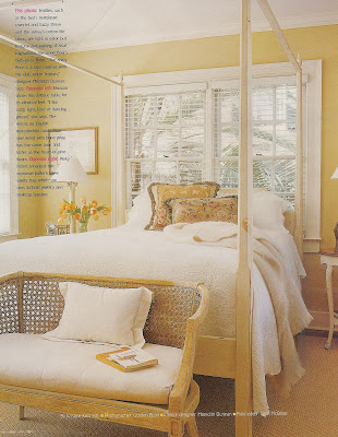
This room with its small size and window at the head of the bed is the most like my own, structurally speaking. And while I like the idea of a canopy or poster bed, I'm afraid I would tire of it. And I do like the headboard I have. The quiet colors here with just a touch of pattern in the needlepoint pillows appeal to me and make me think that I might, maybe, be happy with less pattern.
This room is just so cheery, I had to include it. I also like the juxtaposition of black lamp shade and dark windows with the white walls.

Phoebe Howard is one of my favorite designers and I love her use of soft, muted colors in rooms like this bedroom, below. I get my blues and yellows but in pale, creamy shades instead of the more vibrant tones in the pics above. Further inspiration for me to "tone it down" a bit.

But if I took the Phoebe Howard room and added a few more patterns and just a pop of brighter colors, like in the art and center pillow in the room below, I think I'd be happier. I also like the modern lamps in combination with the largely traditional elements in this room.

This beautiful blue room I love for its use of mixed patterns in a quiet color scheme. What I like most though is the burlap bedskirt!

I've included the photo below because of the window treatments. A few months ago, I bought panels very much like these for my bedroom. Same golden color, same linen-like texture, they even have brassy rings sewn into their French pleats. I wondered if I could combine the bright brassy rings with a dark antique brass rod, and this photo answered that question for me. Yes, I can.

The bedding below is new from Pottery Barn. They say the pattern was inspired by a vintage American fabric from the 1920's. If it's as pretty in person as I think it is on their website, it might have to come home with me. So much for my quiet bedroom!

Finally, this image begged to make an appearance! Isn't it pretty?! The home of this young designer, Rosie Winstead, was featured in the Spring 2008 BH&G Special Interest magazine called Decorating. Her entire home is just as fresh and fun as this bedroom. And while this level of fearless exuberance is not likely to happen in my space, I'm very inspired by it nonetheless. The painted furniture, bed-framing window treatment, vintage art and cheerful mix of pattern and color will all, I'm quite sure of it, find their way into my room.

As I was preparing this post for publication this morning, I noticed that the ladies of the Skirted Roundtable (link to it here or from my sidebar) have focused their newest podcast on bedrooms. What they like to put in them, whether for clients or themselves, and why. Something Joni (of Cote de Texas) said during their conversation reminded me of a design principle I read somewhere many years ago and have used in my own master bedroom decorating ever since. It explains why I'm all for decorating a room that I share with my husband in such a feminine way. Joni attributed this philosophy to design icon Charlotte Moss (I did not know that, thanks Joni!) and it is that the bedroom shared by a man and woman should appear to be the woman's "boudoir" that the man has been invited into. I love that! And, lucky for me and my flowery bedroom, the man in my boudoir gets it and appreciates it and is more than willing to assist in its long-awaited transformation. I'll keep you posted on our progress!