Showing posts with label decorating with collections. Show all posts

Wednesday, July 7, 2010

New Art Arrangement Over My Sofa

This vintage print has hung over my living room sofa for about a year now. I found it in an antiques and collectibles co-op in Bakersfield, CA that occupies an old Woolworth's department store—a great place worth visiting if you ever find yourself in that neck of the woods. You can spend hours shopping for treasures on multiple floors then replenish your energy with a burger and a milkshake at the original luncheonette counter!


I actually passed on the print when I first spotted it because I already had so much set aside to buy. But it was one of those things I thought about for the next few days after I got back home. That's happened to you too, right? So, knowing my mom would be in the area again within the week, I asked her to pick it up for me—fingers crossed that it would still be there. Happily, it was and it's lived somewhere in my living room ever since. I really, really love it—the colors, the subject matter, that great frame— but at 34"x24" I've always known it was too small to hang over the sofa by itself. Because I wanted it there anyway, I hung two creamy decorative plates one above the other to the right of the print to create an arrangement with more weight. It looked forced and just not right. What to do? Ignore it of course! Until one day last week when I couldn't stand it any longer and decided to dig through my inspiration files.


A gallery or salon style arrangement is what I really wanted. Something along the lines of the one above from southernliving.com or the one below from gaitaninteriors.com. See how much space they fill over these sofas? Linda Crisolo, Marketing Director of Art.com says we should "make sure artwork is at least two-thirds the size of the sofa. For example, a 9-foot-long sofa should have a 6-foot-wide expanse of art above it." My 34" wide print was barely filling one third of my almost eight-foot wide sectional.


When it comes to salon style art, I am drawn to a looser arrangement of prints like those seen above. You may prefer a tighter, more controlled arrangement like the one below I found on Martha Stewart's website. I do have one small bone to pick with Martha, however, and I'll turn again to Linda Crisolo of Art.com to explain what that is: "People have a tendency to hang art too high," says Linda "The center of the image should be at eye level. In living rooms, people are usually sitting, so artwork should be lower. A good way to ensure you're placing artwork at the right height is to hang it one hand width above the sofa". Sorry, Martha. There are too many hands between your sofa and your art. It certainly is expertly aligned though.


Speaking of alignment, here's a look I love, from Traditional Home magazine, that is absolutely wrong for my room. Black and white photos of trees hung on a tight grid fill the space over this sofa—side to side as well as from just above the sofa to very near the ceiling; fifteen individual pieces reading as one large work of art. Beautiful, quiet symmetry. Inspiration photos can sometimes show you what won't work in your space as much as what might and, as I mentioned, I like things a little more mixed-up and colorful than this.


Now, here's some great color! Gorgeous panels that, again, completely fill the available space, below. Love the furniture, love the tablescape, LOVE the art and color story, but there's still something here that's not quite "me". Maybe "me" in a different kind of house, but not in this cottagey little ranch-ette I'm living in.


Aha! Now this one, below, is definitely me! This page torn from one of last year's Better Homes and Gardens speaks to me, first, because I am a complete sucker for striped walls (never mind that there is not one striped wall in my home) and, second, because I love the mix of vintage-looking art and colors and the variety of frame shapes and sizes. I also like the use of dimensional objects such as the plates and vase. But I already have a wall-mounted lamp on my wall so I'll reject the idea of dimensional art while I embrace the use of multiple colors, a vintage feel and subjects found in nature.


Inspiration image in mind, I poked around in closets and under beds for art to buddy-up with my favorite print from Woolworth's. Here's what I came up with:


The lighting is a little dim in this room even on the brightest day, and lately we've been having a lot of gloomy ones, so please bear with my amateur skills. Natural light photos without the lamps lit gave me the best results. And besides, my million-year-old sofa would rather be captured in low light and fuzzy focus anyway, thankyouverymuch. Looks good from back here, doesn't she? Especially with all her pretty mixed-up pillows acting as distractions.


I found a nice mix of frames to complement my centerpiece: a green one, a black one, a little gold one and two distressed white ones. The subjects too complement the central landscape: one vintage botanical greeting card, a floral watercolor, two bird prints and one seaside painting on a postcard. The mix of colors and styles feels just right.


I purposefully placed the arrangement slightly off-center above the sofa and closer to the table lamp than to the wall lamp because I didn't want the wall fixture to appear as part of the group. Placed this way, the grouping also hangs more toward the center of the room which is most pleasing when this wall is viewed from adjacent rooms. Long explanation shortened: it just looks better that way!


See that light fixture on the wall up there? That's my solution to lighting over the corner of the sectional. I didn't want to place a table or a floor lamp behind/beside the sofa, so we mounted an old yard sale find on the wall. Its twin lives on the same wall at the other end of the room. Lit at the same time, they help fill the room with light when we have a crowd. This one lit by itself provides just the right light for reading (and blogging) when I'm tucked up into the corner of the sofa.


Gallery and salon style arrangements are not new to my house. I've always enjoyed massing art and objects together—sometimes a little too much. Sometimes to the point that I tire right away of the visual "clutter" and have to take everything down and start over. More than once on the same day I put it all up! This wall though seems quieter to me than other arrangements I've put together. That it's been up for almost a week and not one thing about it "bothers" me when I pass through this room tells me that it might be here to stay a while. At least I hope so. I have too many other unfinished projects to attend to. . .

Friday, May 14, 2010

Other Ways to Decorate with Books


In my last post about backing your bookcase, you saw books in their natural environment. Lined up, stacked, contained and confined. That doesn't sound so great though, does it? If you love your books as much as I love mine, spread some of them around. Let them have some fun! These books, above and below, get to welcome your guests and roll around on a tea cart.

[Better Homes & Gardens]

These get to stack up with a bunch of their buddies on a pretty purple table. Notice how some are acting as risers to show off accessories and lend dimension to the tabletop display. Books, like dogs, are happiest when they have a job to do.

[Elle Decor]


Here, a few carefully-coordinated volumes support a beautiful arrangement of flowers so that it's not overshadowed by the drama of the shell-framed mirror.

[Lynn Von Kersting via BH&G]

Also in an important supporting role, the books on the left-hand bedside table lift the lamp to the same height as the one to the right. Think about this next time you use mismatched tables—or mismatched lamps—beside your bed or sofa. Keep your lampshades lined up. Books love to help.

[Southern Living]

When you've run out of conventional storage space, as Joni did, pile your books on a table, stack them in baskets, add a collection of objects and your overflow becomes artful arrangement. No one needs to know that you've simply bought way too many books!

[Cote de Texas]

A single, beautiful book becomes art itself. Albertus Seba's Cabinet of Natural Curiosities, below, has been the center of attention on countless coffee tables. No doubt the other books are jealous, but some are just born to be stars.

[Kendall Wilkinson via OKL]

Other books enjoy being members of the ensemble. In this display, below, colorful books arranged facing forward on ledges take the place of artwork above the sofa.

[Pottery Barn]


High above the sofa—and everything else!—these brave books line up on shelves built over the windows just for them. How will they ever get down? Your guess is as good as mine.

[Apartment Therapy]


At the opposite end of the wall, way down at kid level, the books below are displayed on an old-fashioned plate rack, making them easy for little hands to grab at story time. Plus, their attractive covers make great art in your child's room.

[Martha Stewart Living]

All the way down on the floor now, a graduated stack of books becomes a table. This is the perfect job for those over-sized volumes that don't easily fit into bookcases. A tip: don't put much on top of that stack in the way of accessories. It's not the most stable surface after all. Do leave room for your cup of tea and a small plate so you can have a snack while curled up in the adjacent chair. Reading, of course, yet another book.

[Real Simple]

The ultimate in "books as decor"—a dedicated library. This one was created from an under-used dining room. A terrific idea, I think. On most days this room serves as reading, research and storage space. Then, imagine how cozy it would be to dine by candlelight among the textures and colors and countless stories contained within your collection of books.

[Cottage Living]

If you're interested in learning more about decorating with books, here's a book named just that. I don't have this one myself, surprising considering how much I love both decorating and books. I have peeked into it at the bookstore, however, and it probably will come home with me sometime soon. Because you really can never have too many books. Even books about books.

Monday, April 5, 2010

Love Nest


Have you been watching the new series "Life" on Discovery Channel? If you were fascinated by the images and wonders of "Planet Earth", you'll want to check out "Life". Last night, I watched the "Birds" episode and my shelter- and decor-obsessed eye was naturally drawn to the bowerbirds of New Guinea. It is seriously amazing what the males of some species will do to get a girl.


As part of their courtship and mating ritual, the male birds build a bower, a structure made of sticks and twigs. The New Guinea variety of bowerbird builds the most impressive display, a maypole bower, which consists of a center support and a wide, domed roof. The photo below will help you visualize just how large such bowers can be. The bird you see to the left of the center support is typically eight or so inches tall. Another variety of the species, the bowerbird of Northern Australia, builds an avenue bower, two walls of vertically placed sticks that resemble the classic laurel leaf crest.


Once construction is complete, the decorating process begins. Most often, the floor of the maypole bower is cleared of all unwanted debris. A carpet of green moss may be laid. Piles of colorful objects, the brighter and shinier the better, are collected and artfully arranged in and around the bower. Different species of bowerbirds are known to collect materials unique to them, or perhaps to their surroundings, which may include shells, leaves, flowers, feathers, stones and berries. Discarded plastic items, coins, nails, even bits of glass—things left behind by human inhabitants within the birds' range—are often used as well. Hours will be spent arranging and rearranging the items, often numbering in the hundreds, in a way the bird believes will best present him as an ideal mate.


Several males will build bowers in close proximity to one another, which makes it much more convenient for the female bird to choose between them. She visits often during the building process. She will closely examine the collected objects and quality of construction once each bower is complete. In the end, she may select the same male she chose last year if he continues to impress. Under-performing males are left without mates and nothing but time—time a smart bird would put to good use improving his bower-building skills. Interestingly, once the bower has played its part in the mating ritual, it is abandoned. Nesting takes place in more humble surroundings, built by the female herself, of soft materials, such as leaves, ferns, and vine tendrils on top of a loose foundation of sticks.


Patrick Dougherty is an artist from North Carolina who, like the bowerbird, builds elaborate, fanciful structures from twigs and sticks. While it does not appear as though Mr Dougherty does this to attract a mate, his art certainly attracts attention. His works intrigue viewers, drawing them in for closer inspection, like a female bowerbird to the most beautiful bowers. With birds (and beavers) as his guides, Dougherty sometimes takes up to a full year to construct his installations in pastoral settings, among buildings and trees, and within the walls of museums worldwide. Of his work, the artist says "Art that's made out of natural materials goes out into the civilized world while coexisting with the natural world, so it offers a new way of looking at both". Images below are from stickwork, his aptly named website. The ephemeral nature of these stick structures, whether built by bowerbirds or artists like Patrick Dougherty, make it important to fully appreciate them once encountered as it's unlikely they'll still be there on your next visit.
If you have experienced such art in person, whether built by bird or man, I'd love to hear about it.


Trailheads. North Carolina Museum of Art, Raleigh, North Carolina. 2005


Call of the Wild. Museum of Glass, Tacoma, WA. 2002


Na Hale 'o waiawi. The Contemporary Art Museum, Honolulu, HI. 2003


Sortie de Cave. Jardin des Arts, France. 2008


The Summer Palace. Morris Arboretum of The University of Pennsylvania, Philadelphia, PA. 2009

Sunday, December 27, 2009

A Lovely Post-Christmas Gift


Sitting here on my sofa, the hazy blur of Christmas (barely) Past still all around me (or maybe it's the NyQuil kicking in... I have a terrible cold), I received a wonderful, completely unexpected gift when I peeked into one of my must-read blogs. Maria Killam of the always educational, always entertaining, always stylish Colour Me Happy has published a list of her favorite posts of the past six months and one of mine is on her list!


My post titled "Collections, Part One: On The Wall" (as well as its follow-up post on how to hang a collection on your wall ) found its way into her favorites folder and reappeared among the most flattering company imaginable: posts on Cote de Texas, Design Ties, The Lisa Porter Collection, Pure Style Home, Things That Inspire, Velvet & Linen, La Dolce Vita, Belgian Pearls and Discover: Interior Design were the others in Maria's top ten. (click on the blog names to go to the posts Maria features) To say I'm blown away by being included among these talents is a crazy huge, can't-even-tell-you-how-enormous understatement.


Now, I'm extra-inspired to continue the series on collections I began before the holidays took over my life (and all the design blogs). The photo above is a sneak peek into the next one. Knowing that Maria may be watching, I'll be re-reading and rewriting and editing like mad hoping to continue to meet her high standards.

To read Maria's entire post, click here. While you're at it, if you're not already familiar with her fabulous blog all about color (or colour as she writes it... don't you love that?... she's Canadian), take some time to look around. You'll be glad you did, and I'm sure you'll learn a thing or two... I always do. Thank you so much, Maria!

Monday, November 16, 2009

Hanging Your Collection: A Quick Tip


Consider this post the "Part B" to my last post about arranging a collection on your walls. . .

Whether you're hanging framed art or objects, in sets of two or four or more. . .


. . . horizontally or vertically. . .


. . . following a single line or a grid, the planning and placing is fairly straightforward—if the individual pieces are all the same size and shape. You measure and plot and level and hammer or drill and hang your collection in fairly short order.


Arrangements become more complicated when your collection consists of pieces of varying sizes, shapes and visual weight. For frames, a gallery system like the one below from Pottery Barn can simplify the process. The bonus here is that you can make changes easily should you tire of the order or any individual element.


If you wish to hang a collection of varying shapes and sizes directly on the wall in the salon style, as a vertical collage of sorts, you'll benefit from these tips I found at bhg.com.


Here's how to get a successful arrangement like the one you see above:

1) Trace each frame or object in the group onto brown kraft paper and cut out.
2) Label each cut-out with a description of the picture/object or a corresponding number.
3) Accurately mark on each paper cut-out the location of hanging hardware on the back of each frame or object.
4) Using blue painter's tape (its low-tack adhesive won't pull up wall paint), adhere the papers to the wall. Experiment with arrangements until you have one you like. (Here's an extra tip from me: arrange the actual art pieces on the floor nearby so you can see how each piece relates to the next in the order you have in mind. Paper shapes help you achieve a pleasing layout, but seeing the actual objects in those places gives you a better idea of the final look.)
5) Install picture-hanging hardware directly through the paper on the marks you made. Pull paper away and hang pictures one by one.


Even a very large arrangement can be achieved using this method. . .


. . .as you can see in these pics, above and below.


One more tip, for Melanie, who commented on my last post that she has a high-ceilinged wall to decorate in her new home, and would like to use plates somewhere too. . . the photo below combines these two ideas. A very tall wall decorated with a collection of plates in the same pattern becomes a striking focal point in this home's foyer. The paper cut-out method described here would be very useful in a space like this where avoiding mistakes means fewer climbs up and down the ladder.


Photo sources, top to bottom: pointclickhome.com, southernaccents.com, chrismadden.com, pointclickhome.com, potterybarn.com, bhg.com (x5)

Thursday, November 12, 2009

Collections, Part One: On The Wall

Believe it or not, the fantastic vignette you see above, featured in the late, great Cottage Living, came about with the designer's attempts to display a favorite plate collection. What developed is one of my favorite images from any magazine ever. Not only because I love every element in this space, but because the entire look spun off of a simple collection of white plates.

With the following images, and the series of posts to come, I'll show you how anything you collect can become a much-loved, personal feature of your home's decor.


Here's another collection of plates and platters taken out of the dining room and into the living room of a city townhouse. The symmetrical arrangement of the plates lends them a sense of formality and gives them the look of one unit. That they're all blue and white also helps them to read as one work of art rather than many individual pieces. If you've never thought of your plate collection as something you would hang on a wall, consider taking them out of your cupboards and china cabinets and give it a try. You've collected them because you love them—why not put them on display. For the best way I've found to hang plates, go to this post.


This homeowner, above, chose to display a collection of free form glass bowls on a wall rather than lining them up on a tabletop.

Something most of us have in our homes is a collection of photos. There are all kinds of "rules" about displaying photos. The two most common being (1) that all in a collection should be black and white or all should be color, but the two should not be mixed, and (2) that all should be framed in the same color and style. Now, I break the second rule all the time (for my own tabletop displays) but I rarely break the first. For a large wall display such as these, below, I think it's important to follow both.


A collection of black and white cityscapes is arranged above the wainscoting in an entry hall. The subject matter of the photos—architectural images with straight lines and crisp edges—dictates the rigid grid arrangement used here. The arrangement is softened considerably though by the way the designer chose to hang the top row but prop the bottom row on the wainscot's molding.
Notice too how the frames are arranged so that the aspect of every other is either horizontal or vertical. That took a lot of planning before framing, but the subtle effect and attention to detail was well worth the time and effort.

Another collection of black and white photos is given a much looser treatment, above, to great effect. While the subject matters vary wildly, the group is given cohesion by the use of all black frames and the tight arrangement in which they're hung.


In a previous post, I showed you my husband's collection of military photos. I thought it might be interesting to show you how I wrapped the collection around a corner as it was simply too large to hang on one wall. Notice that the frames are justified, or lined up, where the walls meet leaving only a small break between the two planes to allow the eye to view the collection as a whole. Please excuse the fuzzy photo and the fact that I've broken the "same frame" rule. Most are hung in the frames they came with and I believe the visual strength of the subject matter reduces the need for matching frames. I've also broken the "all black and white" rule with the colorful certificate of my husband's Naval service in Iceland. It fits the theme and makes the collection more personal.


If you have a very large space to fill, a cohesive collection like the ones above and below will do the job. The repetition of shapes, colors, subjects and framing style, give these many pieces the look and weight of a single, large piece of art. Notice too the different ways the two groups are arranged: the neutral-toned sketches, above, are hung in identical frames on a tight grid almost creating the effect of wallpaper or architecture. This arrangement perfectly suits the quiet, classical feeling of this room. The plein air paintings, below, being of differing sizes, are hung closely together but in a looser, oval arrangement, which not only suits the more casual atmosphere of this space, but the fluid lines of the landscapes they depict. Both collections are impressive and made even more so by the prominence they are given within their spaces.


A collection of framed botanicals, below, is hung in a space that can be quite awkward to decorate. Staggered as they are up the staircase wall, they fill the large space while still appearing as a unit held together by similarity of subject and coloration. That they also relate by color to the wall behind them helps them to recede into the wall visually rather than come forward in a way that might look messy and cluttered.


Another collection of art in frames is this series of abstracts. The painter may not have meant for them to be a collection at all, simply color studies or practice pieces. Cut down to the same size and framed identically, they become a colorful, meaningful collection. You can do the same with a collection or your child's artwork, pages from a favorite illustrated book or a collection of wall calendar art.


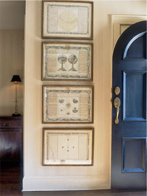
Three vintage botanical charts found at flea markets make a charming collection when hung together. Because of their size, you might be tempted to hang individual pieces like these on different walls, maybe even in different rooms thinking that they'll tie your spaces together. Please resist that temptation. Hanging them together like this maximizes their impact and each makes the other look better.


Much like a homemade quilt can contain favorite memories of childhood or ancestry through the use of meaningful textiles, so can a collection like the one below. Fabric remnants—pieces of clothing, tablecloths, embroideries— that by themselves have outlived their usefulness, can be framed, hung as a group and given new life. Loosely arranged as you see below, the display is casual but still has a lot of impact. Notice again what ties this collection together: identical black frames and the red and white coloration of the fabrics.


Do you have a collection of scarves or handkerchiefs tucked away in a drawer? Would you enjoy seeing them as part of your home decor? Frame them and hang them together. The graphic impact of a grouping of framed textiles is much the same as the impact of patterned plates. And just as you would with a plate arrangement, it's important to hang textiles that look good together and relate to each other whether through color or design or era.


A collection of matchbook covers, below, has been mounted, matted and framed as wall art. Not only does the framing protect them from the wear of handling, it elevates their perceived importance and gets them out where they can be seen and appreciated. The same can be done with a collection of postcards, vintage business or calling cards—any small-sized paper ephemera that might otherwise languish in a drawer somewhere can gain new appreciation and stature when displayed like this.


Collections displayed on walls do not have to be items that fit into frames, as I've already shown you with plates and botanical charts and glass bowls. This collection of guitars is arranged in a way that is both practical and pleasing to look at—especially if you're the person who loves them.


On a recent episode of a new television series, I noticed a teenaged boys' room that had been decorated with a collection of skateboard decks. That seemed an appropriate place for such youth-oriented items. Here, however, notice how a large collection of humble, used decks has been given art gallery status in the way they're arranged in this hallway. I'm not sure whether this is a public or private space, but the photo serves to illustrate that virtually any collection, when properly displayed, can have terrific impact and add loads of visual interest to your home—especially when the subject of the collection is this unique and unexpected.


Even purely utilitarian objects, never meant to be decorative, take on the status of "art" when a collection is framed and presented as such. I'd like to imagine that these kitchen utensils belonged to the owner's grandmother and hold memories of long ago family gatherings.


In following posts, I'll illustrate how collections of many types can be put on display in various ways to become part of your home's unique personality. The great thing about decorating with collections is that you very likely already have a collection of some sort in your home. Barring the need to frame anything, you can achieve great impact with minimal expense and personalize your decor to the degree that store-bought wall art cannot. I hope this post has already given you some helpful ideas. Stay tuned for more...