

I actually passed on the print when I first spotted it because I already had so much set aside to buy. But it was one of those things I thought about for the next few days after I got back home. That's happened to you too, right? So, knowing my mom would be in the area again within the week, I asked her to pick it up for me—fingers crossed that it would still be there. Happily, it was and it's lived somewhere in my living room ever since. I really, really love it—the colors, the subject matter, that great frame— but at 34"x24" I've always known it was too small to hang over the sofa by itself. Because I wanted it there anyway, I hung two creamy decorative plates one above the other to the right of the print to create an arrangement with more weight. It looked forced and just not right. What to do? Ignore it of course! Until one day last week when I couldn't stand it any longer and decided to dig through my inspiration files.

A gallery or salon style arrangement is what I really wanted. Something along the lines of the one above from southernliving.com or the one below from gaitaninteriors.com. See how much space they fill over these sofas? Linda Crisolo, Marketing Director of Art.com says we should "make sure artwork is at least two-thirds the size of the sofa. For example, a 9-foot-long sofa should have a 6-foot-wide expanse of art above it." My 34" wide print was barely filling one third of my almost eight-foot wide sectional.

When it comes to salon style art, I am drawn to a looser arrangement of prints like those seen above. You may prefer a tighter, more controlled arrangement like the one below I found on Martha Stewart's website. I do have one small bone to pick with Martha, however, and I'll turn again to Linda Crisolo of Art.com to explain what that is: "People have a tendency to hang art too high," says Linda "The center of the image should be at eye level. In living rooms, people are usually sitting, so artwork should be lower. A good way to ensure you're placing artwork at the right height is to hang it one hand width above the sofa". Sorry, Martha. There are too many hands between your sofa and your art. It certainly is expertly aligned though.

Speaking of alignment, here's a look I love, from Traditional Home magazine, that is absolutely wrong for my room. Black and white photos of trees hung on a tight grid fill the space over this sofa—side to side as well as from just above the sofa to very near the ceiling; fifteen individual pieces reading as one large work of art. Beautiful, quiet symmetry. Inspiration photos can sometimes show you what won't work in your space as much as what might and, as I mentioned, I like things a little more mixed-up and colorful than this.

Now, here's some great color! Gorgeous panels that, again, completely fill the available space, below. Love the furniture, love the tablescape, LOVE the art and color story, but there's still something here that's not quite "me". Maybe "me" in a different kind of house, but not in this cottagey little ranch-ette I'm living in.

Aha! Now this one, below, is definitely me! This page torn from one of last year's Better Homes and Gardens speaks to me, first, because I am a complete sucker for striped walls (never mind that there is not one striped wall in my home) and, second, because I love the mix of vintage-looking art and colors and the variety of frame shapes and sizes. I also like the use of dimensional objects such as the plates and vase. But I already have a wall-mounted lamp on my wall so I'll reject the idea of dimensional art while I embrace the use of multiple colors, a vintage feel and subjects found in nature.

Inspiration image in mind, I poked around in closets and under beds for art to buddy-up with my favorite print from Woolworth's. Here's what I came up with:

The lighting is a little dim in this room even on the brightest day, and lately we've been having a lot of gloomy ones, so please bear with my amateur skills. Natural light photos without the lamps lit gave me the best results. And besides, my million-year-old sofa would rather be captured in low light and fuzzy focus anyway, thankyouverymuch. Looks good from back here, doesn't she? Especially with all her pretty mixed-up pillows acting as distractions.

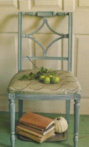
I found a nice mix of frames to complement my centerpiece: a green one, a black one, a little gold one and two distressed white ones. The subjects too complement the central landscape: one vintage botanical greeting card, a floral watercolor, two bird prints and one seaside painting on a postcard. The mix of colors and styles feels just right.

I purposefully placed the arrangement slightly off-center above the sofa and closer to the table lamp than to the wall lamp because I didn't want the wall fixture to appear as part of the group. Placed this way, the grouping also hangs more toward the center of the room which is most pleasing when this wall is viewed from adjacent rooms. Long explanation shortened: it just looks better that way!

See that light fixture on the wall up there? That's my solution to lighting over the corner of the sectional. I didn't want to place a table or a floor lamp behind/beside the sofa, so we mounted an old yard sale find on the wall. Its twin lives on the same wall at the other end of the room. Lit at the same time, they help fill the room with light when we have a crowd. This one lit by itself provides just the right light for reading (and blogging) when I'm tucked up into the corner of the sofa.
Gallery and salon style arrangements are not new to my house. I've always enjoyed massing art and objects together—sometimes a little too much. Sometimes to the point that I tire right away of the visual "clutter" and have to take everything down and start over. More than once on the same day I put it all up! This wall though seems quieter to me than other arrangements I've put together. That it's been up for almost a week and not one thing about it "bothers" me when I pass through this room tells me that it might be here to stay a while. At least I hope so. I have too many other unfinished projects to attend to. . .


35 comments:
I like your new wall, Tracy! It's very well placed and the art all works cohesively while still looking eclectic and interesting.
And you're right: Martha's arrangement is WAY too high.
tracey Poor Martha hung her art too high!! Great post showing great examples of what you are going for and I think you accomplished your goal. It is so nice to use what you have and for it to turn out just like you wanted, Kudos to you!!! Now you can sit back and enjoy your hard work,Kathysue
Hai.. great presentation, excellent tips. your Photography is also good. Thanks for sharing your ideas.
I think you did a fine job on your wall! Nice inspiration in your post!
Helle:))
Your gallery wall is wonderful, Tracy.
hi tracy,
this is just like you to thoroughly research this topic. me, i just start nailing!
so happy to see a small slice of your home. the wall looks fabulous as does everyting else. well done!
~janet
I had such a great time reading this post and seeing all the examples - honestly, yours looks the best. It's just random enough that it doesn't look forced and the off center totally works. I think it's the mix of pillows too that works so well -
You did a great job and I loved seeing this room.
Have a great day - hope you get another project done!
Sarah xo
It looks great!!!! Not just anyone can do that... you did good gf ! 5*
Love love love it! It was fun seing all of the others as well. Thanks! Susie~
This is lovely! It was fun to see your inspiration photos turn into your take on the gallery wall. Job well done!
This is a great post and very informative. I like your new wall and have attempted this myself just haven't pulled it off very well.
-Rene
Your arrangement looks great.
I enjoyed nodding in agreement as you pointed out Martha's flaws, too ;)
Looks great. I love the variety of pictures and I like the light fixture as well. I just put up some wall are too.
http://kathieysworld.blogspot.com/2010/07/decorating-with-my-photos.html
Thanks for your post:-)
Very, very pretty! Love the arrangement and selections! Now you can enjoy more than that one favorite. You got 'em all there.
So beautiful Tracey! Could you email me your address so I can send you a little something?
BTW...the corner of that sofa looks like a marvelous place to blog :)
Best,
Michelle
Tracy,
I love what you did and your sofa looks oh so comfy!
xx
What a very comforting place to have. Lovely sofa's too. I think the photo number 4 fits for my new condo. :)
Paula M
I love the way you decorated your living room. I agree in the way you've described as an art gallery. It gave me the idea to hang my husband's photos. In fact, I'd like to have our living room as a place for our visitors to get to know my husband's art. Redecoration includes changes in our furniture, house paint and flooring. Showrooms in Florida offer a lot of designs, I'd like to visit one and see what matches to my husband's artistic works. Thanks again for sharing.
http://orlando-buyersagent.blogspot.com/2010/12/condo-financing-tips-before-you-buy.html?showComment=1346242067231#c249827679607857114
I really love the paintings. Can you share how much those paintings are? Found some great paintings at SC Luxury Mag, but I didn't get a chance to buy one before I left Singapore.
I really love your write-ups guys continue the good work. balivillasretreats
Exellent post given in this blog.Fortune Oriental Holdings Limited (FOH) LLC, is a Restaurant furniture manufacturer. We are leading
supplier of office furniture and Restaurant furniture in USA and Canada.We are best furniture
companies in USA.We have online furniture stores USA.Call Center Furniture Chicago.
Very interesting article,
Gold star bathroom is a reputed name amongst the companies associated with a bathroom renovation Brisbane. This company is operational in the Brisbane Southside and Northside suburbs. The expertise service is blended with a passion to bring the idea of reality to meet the ensured standard and expectation of renovation. The expert team is highly proficient to bring about correct solutions to introduce outstanding and friendly service.
Very nice blog, intresting to read
large bathroom renovation
very nice article, thank you, if you want bathroom renovation brisbane visit our official website
Very intresting article, thank you
Brisbane bathroom renovation
This is awesome article thank you
Gold Star Bathrooms is a leading company in the area of Bathroom Renovations Brisbane. Our team offers you brand-new luxury ideas, each idea provide comfort in your life, and inspiring you for renovation such as relaxing tubs, glamorous vanities, and sleek showers. From crisp and approachable to luxurious and extra, see stylish spaces that mid-afternoon daydreams are made of.
Very interesting article, I really appreciate it.
Looking for a bathroom designer in Brisbane? Gold star bathrooms are considered brand names that provide suitable accessories for bathroom renovations in Brisbane. Here one can even get the solution for entire house renovation such as kitchen, living space, etc. They are professional experts who can easily make the tile installation to make the property beautiful.
Very interesting article, I really appreciate it.
Gold star bathroom not only renovates bathroom to make the home lively but even add values to make a worthiest decision while sale and purchase of the house. They have the experts who are experienced in offering complete bathroom renovations solution that opts to be a perfect fit for small and large bathroom renovation. This is an experienced team of professionals who are trained to offer friendly service from the initial concept of finishing and fixture.
Homewerkz offers a wide range of bathroom accessories to pick from. We provide bathroom accessories of well-known brand like Geberit Singapore at a reasonable price. We also provide well-designed accessories for your bathing arena and make it comfortable for you and we also allow consumers to speak with us directly about any product issues.
Homewerkz is the leading showroom that famous for providing the simplest quality Rain Shower Singapore to their clients. You’ll likewise have to consider the designs and colors after you are picking the simplest shower head for your bathroom. For further details about all the items, visit the official website of the company.
Really good post, thank you for sharing.
Rain Shower Singapore
Awesome Article and have more good Information. keep it up. Great work! Eighteen Islamabad
Geberit Singapore
Thanks for sharing such information – please look
Geberit Singapore provides a range of benefits particularly in bathroom and plumbing solutions. Their products including the AquaClean shower toilets and concealed cisterns, offer enhanced hygiene, comfort, and water conservation. Geberit also excels in water drainage systems and sanitary piping systems provide efficient and reliable solutions for various building types. The offered products are known for their features like warm water cleansing, adjustable spray settings, as well as heated seats, promoting a higher level of hygiene and comfort as comparing with traditional toilet paper.
https://www.bathroomgallery.com.sg/geberit.html
I have no idea if this website is still up and running, but if it is, I have been searching high and low for the photo that you show at the top of this post. I was born in 1960 and this photo used to hang above our couch as well. I have no idea over the years what happened to that print that my parents had but I used to love it and would stare at it for hours for some reason. If you still have that, are there any identifying marks as to who produced the print that you can see? I’ve been trying to find this on the Internet so that I could buy it and I know you found it at a flea market and that is awesome. I’m just at a loss as to where to even start to look for it other than vintage photos of cottages. I have a screenshot from a black-and-white photo of ours that shows that same picture and that’s all I have to go off of. That’s so awesome that you were able to find this and add it to your collection. I love it.!
Post a Comment