Saturday, February 27, 2010

Cure for the Winter Blues


On a day like today—cold and very, very wet—I find myself looking forward to my spring garden and wondering what is taking so long? The Dutch irises first broke ground way back in November. Their leaves have grown longer, their stems taller and more sturdy and, still, there is no sign of their brilliant blue blooms. Perhaps they need less rain and more sunshine. I know I do.


The iris is February's birth flower. But they're not going to make it in time to celebrate—not at my house anyway. When they do appear, I'll take note of their three upright petals symbolizing faith, valor and wisdom. I'll remark to someone, as I always do, how much they resemble the French fleur-de-lis which, in fact, was modeled on this flower. History tells many stories of how this came to be and how the symbol has endured. It is impossible to recount them all here. History also tells that symbolic use of this dignified and graceful flower dates even further back—to Ancient Greece—when Iris, the messenger of the gods and the personification of the rainbow acted as the link between heaven and earth. An interesting article about the iris of history and legend can be found here.

Gorgeous blue hues like that of the iris find their way into our homes with such regularity and to such great effect that House Beautiful magazine has devoted much of its March issue to blue rooms of present and past. You can see 53 of them on their website. Below, I've chosen to feature just one for this flower-of-the-month post: the kitchen in a Fire Island, NY summer home that stars a wall of glass subway tile in a color that designer Marshall Watson calls "periwinkle verging on cobalt". How lucky for these homeowners... to have such a lovely color on view all year 'round.


[kitchen photos by Julian Wass via housebeautiful.com]

Happy birthday to all you February babies out there including my mom, who reads my blog (thanks Mom!), and my dad who I'm quite certain doesn't even know what a blog is. :)

First photo by dks221 via webshots.com, second photo is my garden by me

Thursday, February 25, 2010

Field Trip: The Huntington, Part 2. The Art All Around Us


In the 1790's, the printing method called lithography was invented by a young German playwright who wanted a cheaper, faster way to publish his plays. Copper engraving and woodblock printing weren't getting the job done for him. His new technique was successful, but it wasn't until the mid-19th century that lithography's true impact on the world would be felt.


"The Color Explosion" brought me to The Huntington—250 objects on display from the private collection of J. T. Last, a prominent expert and author of the award-winning book the exhibit was named for. "We live today in a sea of color images, printed and electronic", writes Last, "and we find it hard to imagine a time when reproduction in color was a prized commodity".


By the late 1870's, improvements made to the original process of lithographic reproduction made it possible for printers to apply multiple colors to a single image. Sheet music was one of the first groups of materials to benefit from color printing and, as seen above and below, the earliest examples were finely detailed but the colors quite subtle. Further advancements in color lithography are directly related to the early history of advertising, branding and product packaging and it was in these areas that the explosion began and grew.


Can you imagine a time when everything, everywhere wasn't being presented and sold to us in bright, blazing color? Probably not. But if you were walking around in your corset and hoop skirt in 1875 and suddenly found yourself accosted at every turn by colorful advertisements, posters, handbills and packages it may have either delighted or dismayed you. So many things calling out for your attention. Did our great-great-grandparents believe that if they saw a product "in color" it was somehow superior? I'll bet many of them did.


Trade cards—smaller that a post card but larger than a calling card—became commonplace tools of "direct marketing" for everything from lawnmowers. . .


. . . to fish. To truly appreciate the significance of such throwaway items as trade cards, you have to understand something about the lithographic process. (I am not the person to explain it. Go here if you're really interested in the details.) Trust me though. The method may have been groundbreaking at the time, but it was still unbelievably tedious and required exacting standards and workmanship. One wrong move and your mackerel would look like mush. Failure in the middle of a twenty step process would certainly kill a printer's profits and, perhaps, his reputation.


As product manufacturers and distributors benefit from lithographic images, so did the merchants of consumer goods. For example, cigar box labels like this one. . .


. . .and this one, were pasted onto the inside of box lids. The boxes were then displayed open on store shelves, the bright images obviously meant to influence selection and purchase.


Book illustration too was transformed by this new, affordable process. Natural history books, children's books and gift books became popular. Full-color product catalogs enhanced the sale of merchandise and books on technical subjects like medicine and science could more easily convey complex information through color illustrations.


Color packaging became ubiquitous to daily life. Seed packets, canned food labels and the like became commonplace. Imagine the cereal aisle in your local market without all those brightly-colored boxes. How could we quickly tell the difference between the Kashi and the Lucky Charms if they were all in shades of black and white?


As color advertising became the preferred way to promote products, so too did it impact the business of event promotions. Posters printed in large quantities could be put up all over town or, as needed, throughout surrounding communities and even neighboring states to draw attendance from far and wide.


Lithographers used their new techniques to colorfully document history too. One of the items at the exhibit I liked best was this map of New York City from 1870. Click on the image below and you'll go to full-screen version. Go ahead, take a few minutes with it. It's fun.


Also fun, for me anyway, was seeing items that represent the history of my own region of Southern California. Throughout this area, at the turn of the twentieth century, towns were born from the burgeoning citrus industry. To identify their product, growers glued highly decorative, colorful labels to their packing crates before shipping them across the country. Here are three I snapped at the gallery (before a docent politely informed me that photography was not allowed—I swear I didn't see the sign!) from Ontario and Riverside, CA.


If you've read my blog for any time at all, you know that I am drawn to bright, happy colors (and lots of them!). I found this exhibit so interesting and I am so glad I took the time to see it and record it here. (Thanks for indulging me if this look isn't your cup of tea.) I can easily imagine designing a room inspired by any one of these images. Hey!. . . maybe I'll do just that and show it to you here. But first. . .

Next post: The gardens at The Huntington.


All images are my photos from the exhibit and garden or were scanned from the exhibit hand-out except: trade cards via the Harvard Business School Baker Library, world fair poster via Getty Images, and New York City map via history-maps.com

Tuesday, February 23, 2010

Field Trip: The Huntington, Part 1. The Mansion and The Galleries


Okay, so I wasn't really in Pasadena. I was in San Marino. But I didn't want you to think I had flown off to some faraway island or magical castle. Judging by just the one photo on my last post, I could have been far away—and it certainly felt that way while I was there. To clarify, the San Marino I visited is a tiny city of only 3.8 square miles that is bordered on three sides by Pasadena, California. Do you remember the movie "Father of the Bride"? The family of the bride lived in San Marino—although I believe the exteriors of their home and neighborhood were filmed almost entirely in Pasadena. Julia knows for sure and you can see more about that home here.

Enjoy the view and then turn around. . .

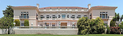
This house with the great view was once home to Henry and Arabella Huntington. At the turn of the 20th century, Henry Huntington was an exceptionally successful businessman who built a financial empire that included railroads, utility companies and real estate holdings. His business ventures led him across the country from New York to San Francisco and, in 1902, to Southern California. In 1911, his Beaux-Arts mansion, designed by architect Myron Hunt, was completed on the property once known as the San Marino Ranch. He married Arabella two years later.

. . . this is what's behind you.

Henry, himself possessed of a special interest in books, art and gardens that had led him to begin his own important collections, was now wed to one of the most highly influential art collectors of her generation. Together, the two amassed materials for what would become one of the finest research libraries in the world and collected rare books and manuscripts of Anglo-American civilization (spanning the ages with the likes of an original Gutenberg Bible and works by Charles Darwin, Thomas Edison, Shakespeare and Audubon) as well as documents from the settlement of the United States as a nation and on to the new frontiers of the American West. They established a significant art collection—greatly influenced by Arabella's interest in European art—that features 15th century Netherlandish and Italian works, 18th century French art and objects and British portraiture, colonial American art and numerous pieces from the mid-20th century. As if all of that weren't enough, they surrounded their mansion with spectacular botanical gardens containing specimens from every corner of the world.

[photo by Matthew Field via Wikipedia]

The library collection alone contains nearly 6 million items. The gardens cover 120 acres. Most of the permanent art collections occupy two large buildings. One is the 16,000 square foot Scott Galleries. The largest gallery was originally the Huntington's private residence, the building you've seen here: 55,000 square feet of paintings, sculptures and decorative objects plus books and furnishings, many of which were in the home when the Huntingtons lived here. Arabella Huntington died in 1924, Henry in 1927. They are buried in a mausoleum on the property.


This map may help give you some perspective as to just how large this property is. See the number 5 in the middle? That's the mansion. The number 7 is the research library and its exhibit halls. To the left of the library is a cluster of dots and symbols surrounding another red roof. That's the entrance, gift shop, offices, etc. Number 23 indicates the North Vista; I'll show you a bit of that in just a minute. Numbers 10, 1 and 6 are other major buildings: the Conservatory through which you enter the Children's Garden; the Scott Galleries and the Boone Gallery. All around the grounds are smaller buildings such as the tea house, Japanese and Chinese structures in their own thematic gardens, trellises, bridges, arbors and gazebos. I was on the property for 4 1/2 hours and only saw the highlights. It would require many visits to see and experience everything.

[via nytimes.com]

Let's take a quick look inside the mansion now. Remember, it's 50,000 square feet. I won't drag you through the whole thing. The architectural style is known as Beaux-Arts, a neo-classical style that combines Imperial Roman, Italian Renaissance, French and Italian Baroque aesthetics and greatly influenced American architects from about 1880-1920. The massive hall, above, runs across the width of the house connecting with all of the public rooms on the main floor. Down the hall and to the left, directly between the two halves of the double staircase, is a large drawing room that opens out onto the south-facing terrace I showed you in previous photos. You know, the one with the view. The house's main entrance is on the north side and is actually quite understated.


Above and below are two views of the Huntington's personal library within the mansion. There is also a smaller, private library in which Henry Huntington conducted business and entertained guests. This room, the large library, was used for entertaining groups and special gatherings and the furniture arrangement was always changing to fit the needs of the occasion. Thus the Regency-period French furniture and original Persian carpets are displayed not in the way the Huntingtons would have lived with them, but to give visitors today the best view of each piece. The room itself was remodelled into an L-shape at Arabella's insistence to accommodate the three enormous 18th century Beauvais tapestries that hang at one end. But you have to look past all that—and the mirrors and chandeliers and intricately carved oak paneling—to see why this room is my favorite. See those floor to ceiling glass-front cabinets? They are full—FULL—of so many books, I can't imagine how long it would take just to count them, let alone read them.

[via nytimes.com]

Fourteen or fifteen cases easily ten feet high and from four to eight feet wide, each packed to capacity with books. You do the math. And, these are but a fraction of the books collected by the Huntingtons. Peering into the cases, nose (almost) against the glass, I saw volumes on the history of Rome and India, accountings of great wars from centuries past, travel diaries from ancient explorations, fact and fiction on every subject imaginable and not one familiar title. Talk about feeling uneducated and unenlightened! But then, in a case near the door, were several volumes of Homer's Iliad and these. . .


. . . a collection of Jane Austen's classic novels. They were bound in a rich teal leather that this photo fails to capture. Dim lighting + reflective glass + sparkly chandeliers shining overhead = difficult to photograph. But there they are. Titles I actually recognized. The coral-red roses and gold imprinting were in pristine condition. At the bottoms of the spines are the words "Chawton Edition". How old does that make them? I tried, unsuccessfully, to find out online. I wondered if these volumes had ever been read or if they were simply "acquired". I wanted to take them home. Don't you think they'd be happier at my house where they'd be touched and loved and cared for, not sealed away behind glass? I do too.

[via nytimes.com]

Since I can't have those books, I'll distract us with this: the gigantic loggia on the east side of the mansion. This photo, above, shows about one third of it. If the large library had doors on its east wall, it would open onto the loggia. I didn't notice while I was inside the library but, from the outside there were doors leading into the house near enough to the library that I could imagine grabbing one of those beautiful Austen books and tucking myself into a wicker chair for hours and hours. Until one of my servants came to call me in for dinner.

[via nytimes.com]

Back in the real world and on the opposite side of the mansion, is the Thornton Portrait Gallery. Recently redesigned to dim the natural light and enhance the paintings and sculpture, this gallery is often a guest's first stop. Because Blue Boy* and Pinkie** live here. See Blue Boy down there at the end of the gallery? Pinkie is on the opposite wall, behind the photographer's back. Here's a better look at them, below. When Blue Boy was acquired by The Huntington in 1921, it became famous around the world for the then record price paid for any painting: $640,000. A typical house in San Marino would cost much more than that today. I have no idea what formula one would apply to determine the current value of something like Blue Boy. Do you?

[via huntington.org]

That's enough of the galleries for now. There's too much in there to talk about here anyway. If you really want to know more about The Huntington and its collections, you can go here—when you're done reading this post, of course. Outside the mansion again, this time to the north, is the aptly named North Vista, below. Flanked by statues, it culminates in a large fountain. On a less cloudy day, the trees of the North Vista perfectly frame a view of the nearby San Gabriel mountains.


This is also the Huntington's camellia garden. Lucky for us, camellias bloom in winter. Also in bloom, at each sculpture's feet, are azaleas in various shades of pink.


This lady stands at the right front corner of the North Vista. I don't know who she is or what she is pointing at but I do know. . .


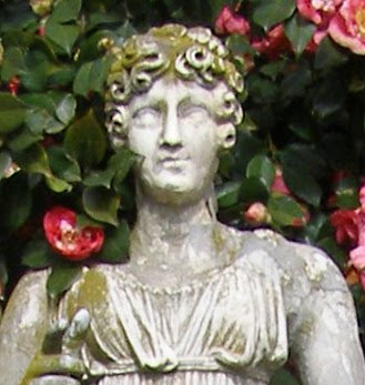
. . . that I love her camellia corsage and mossy green hair. A few minutes' walk past the North Vista is the Scott Gallery, below. As mentioned before, it houses the Huntington's American Art collection.

[via nytimes.com]

Through the gallery's loggia and across a large lawn is the Conservatory, below, behind which is the popular Children's Garden. Beyond that is the mausoleum, eternal resting place of the Huntingtons.


Turn left in the middle of that lawn and you'll take a short walk up to the small Boone Gallery, below. Inside this building is what brought me to The Huntington in the first place. More on that, next time.


[via huntington.org]


Next post: The Art All Around Us. Here's a hint. . .


* The Blue Boy is thought to be a portrait of Jonathan Buttall, the son of a wealthy British hardware merchant and was painted ca. 1770 by Thomas Gainsborough.

** Pinkie depicts eleven-year-old Sarah Goodin Barrett Moulton and was painted in 1794 by Thomas Lawrence.

Unless noted otherwise, photos are mine.

Monday, February 22, 2010

My View From Pasadena


Yesterday, I visited this house and was unexpectedly captivated by the view. Because the home itself is not what brought me to this place. Still, I imagined what it must have been like when people actually lived here. Wondered how practical it might be to ditch my current job and go to work here. So I could see this, and so much more, every day.

More later. . .

Click on the photo for an even better view.

Friday, February 19, 2010

Why Comfort & Luxury?


I have always been interested in how businesses got their names. Now, there's this whole world of blog names to wonder about too. I'm going to tell you about mine. I think it also says something about me and my approach to interior design, decorating and life.
...
For close to twenty years, this quote has inspired me :

"We act as though
comfort and luxury were the
chief requirements of life
when all that we need
to make us really happy is
something to be
enthusiastic about."

Charles Kingsley - English clergyman, university professor, historian and novelist


At first, it became a favorite because it represents to me the conscious effort one must make to appreciate and find enjoyment in the everyday undertakings of life. Rather than lament what we feel is missing, we should focus on what we already have, or should seek to find something, to be enthusiastic about. For some it might be caring for their home and family; for others, their job or an all-consuming hobby or cause. Material things that add to our enthusiasm for life can be anything that pleases us—simply because we possess them, regardless of price or pedigree—like a sentimental object kept on view, a collection acquired after years on the hunt, or a perfectly positioned reading chair. And, of course, we all want to be enthusiastic about the people in our lives—our loved ones and friends—without whom all the riches and possessions in the world would be meaningless.

But then, one day, while preparing myself to pursue a career in interior design, it occurred to me that, while Reverend Kingsley warns against the pursuit of “comfort" and "luxury”, they are, in fact, two things for which I happen to have great enthusiasm. This realization brought about a new interpretation of the Kingsley quote; turning it on its head while continuing to embrace its basic message. I believe that we should choose to seek comfort and luxury in our lives, most especially in our homes. I believe home should be the primary place that comforts and sustains us; that an organized, well-designed space is a desirable and attainable luxury that will enhance and energize our daily lives. Before any of us walk out the door in the morning, our homes should prepare us to face the world. At the end of the day, home should call to us, comfort us, and warmly welcome our guests. Of course, we must also appreciate what a luxury it is to have a place of our own in which to find such comfort.

In the homes of clients, just as in my own, I believe that my brand of comfort and luxury can be achieved on a real-world budget. Knowing what good design looks like, where to splurge and where to save, and how to source smartly and creatively can produce great spaces without great expense. The execution of an idea and enthusiasm for the results matter just as much, if not more, than the dollars spent. In fact, some of my best decorating and organizing ideas have been born of restricted cash flow and serendipitous discoveries. Knowing what pleases you most—whether it is bold colors and loads of accessories or a stripped-down, simplified space—is key to finding a look that feels comfortable and luxurious to you. Whatever your goals, whatever your budget, if you are my client, it is my desire to enthusiastically endeavor to bring comfort and luxury to your life.

That then is the "why" behind the name of both my business and my blog. Here on Comfort&Luxury the blog, I'll continue to show the work I do and the work of others I admire. I'll present ideas and inspiration you can apply to your spaces with or without my assistance. If you see anything you have questions about, on a new post or old, feel free to leave a comment or send an email. If you have a project you'd like my help with, read about my services on my sidebar and contact me. At the very least, I hope you'll keep reading. Because I've become pretty enthusiastic about blogging too.

Pictured above are the Reverend Charles Kingsley and American artist Jessie Willcox Smith. As a writer and illustrator, respectively, each successfully pursued their chosen career paths near the turn of the twentieth century. Those paths crossed when their considerable talents came together in a classic of children's literature : "The Water-Babies, A Fairy Tale for a Land Baby". Written by Kingsley and first published in 1863, the 1916 edition illustrated by Smith became wildly popular and a staple of children's nurseries in the decades following. The images I show here are from that book. You can see why Smith's work continues to influence modern-day illustration artists. At the end of her life, she bequeathed twelve of her original Water Babies paintings, generally acknowledged to be the best work of her prolific career, to the Library of Congress' "Cabinet of American Illustration" collection where they remain today.

Wednesday, February 17, 2010

If Your Bicycle was Paisley, Would You Ride it More?


I think I would.


How could you not want to take such pretty wheels out for a spin? Look at it, will you? Such fun colors! Luggage tan grips and seat. Fenders! And it's just begging for a wicker basket on the handlebars.

Target has partnered with the British brand Liberty of London to bring us, among other flowery lovelies timed perfectly for Spring, bicycles bearing their signature prints. The image above, scanned from the March issue of O Magazine, is the only one I could find to show you. But isn't this one enough? As soon as I turned to page 64, I was on my feet and in the next room announcing to my husband that I have found what I want for my birthday. (insert dramatic display of magazine pages here plus much bouncing and squealing of "Isn't it great?!!) Those of you who think you know me better should stop laughing now. I would too ride a bike.
A paisley bike.


Liberty of London is the 134-year-old British luxury brand best known for its exuberant prints and happy colors like those on their Bouton paisley, above. In recent years, their products have returned to the forefront of fashion. Supermodel Kate Moss used Liberty prints for her clothing collection at UK-based Topshop stores. Hermès produced a line of scarves using Liberty cottons. Now, Target brings Liberty to Americans in one of its largest collections ever presented in collaboration with an outside brand. According to press releases, the line will include fashions for the whole family, housewares, home decor, items for the garden, storage and organization and. . . bicycles!

The Liberty of London line is scheduled to launch on
March 14; you can get a sneak peek here on Target's website. Let me know if you go. . .
and I'll let you know if I score an early b'day bicycle.

This post is for PK at Room Remix who blogged about paisley today.

But not bicycles.