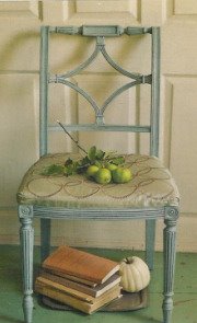
Kitty's common sense and hands-on approach to interior design and decoration were right up my alley. In a recent LA Times article*, the writer called her "the original Martha Stewart" and quoted her personal design philosophy: "It's not what you don't have, it's what you do with what you do have".
For example, the wallpaper she wanted for her small entry hall was discontinued and might have been prohibitively expensive anyway. What did Kitty do? She stencilled and hand-painted a near identical pattern herself. She got exactly the look she wanted for a fraction of the cost of the paper and professional hanging. If you're a regular reader of
, you've seen her do the very same thing in her children's play room. Smart--and talented--ladies.

Kitty also demonstrated how she often repurposed existing furnishings by giving them a coat of paint. When this etagere purchased for her daughter's room outlived its usefullness there, Kitty painted it dark green and moved it to a new space
(see before and after pics below). This is a technique very familiar to
"Nester" who has advocated this idea countless times on her blog. Follow this link to her post
"Painting Pine Furniture" and see her before and after of an armoire that lived in her old house as-is but took on a whole new life, and a colorful coat of paint, in her new house.

Another way Kitty was "green" before it was called that: suggesting slip covers as a way to update the look of quality upholstered furniture rather than replacing the entire piece. It's also a clever way to get two distinct looks from a single piece of furniture. Below, you see Kitty, in her own living room, sitting on her blue summer slips that cover the original blue and green striped floral upholstery. Below that are the same pieces slipped in red for fall and winter.

 Joni of Cote de Texas
showed us a recent example of this type of update by using pieces her client already had. In
the Tanglewood House, toile-covered family room chairs, below, were transformed into the creamy, cozy chenille beauties you see in the next photo and moved into the homeowner's redesigned master bedroom.


As great as these ideas are--and I've used every one of them myself more than a few times--Kitty's best piece of advice, in my opinion, is this:
"SHOP AT THE TOP". By this she means that you should educate yourself in the areas of style and quality before selecting things for your home. Go to the best stores and take a look around. Browse through high-end catalogs, magazines and websites gathering ideas about the things you like from the very best sources.
"Then, when you see something similar at a less-expensive or second-hand store," she writes,
"you'll recognize the quality." If you've spent time looking at high-end products, you just might find yourself one day, shopping for towels or tablecloths in a store at the mall, standing in front of a lamp thinking "Hey, this lamp looks just like the one I saw at 'Fancy Schmancy' except theirs had a red shade and cost a month's salary!" So you buy the more affordable lamp, pick up a new shade and, for far less money, you've created the luxe look you were after.

The lamp on the left, above, is from Horchow. Its rock crystal base, cut crystal parrot finial and red silk drum shade give you a lot of look. . . if you have $3,995.00 to spend on a lamp.
(no, I'm not kidding) The lamp on the right is from JCPenney and is regularly priced at $160.00. At that price, you can afford to buy a fancy silk shade to replace its plain one or even, at someplace like HomeGoods where they always have interesting affordable lighting, you might buy an entire second lamp that has the shade you're looking for and swap. Of course, if your budget allows or you needed a lamp
now, you could have purchased a more expensive lamp and been done with it. If you ask me though, the shop at the top way is a lot more fun! And once you've challenged yourself a couple of times, you'll want to play this game again and again.
I've applied the shop at the top concept to purchases made for my own home as well as for clients. On one memorable occasion, I found a woven hyacinth headboard practically identical to the Pottery Barn model my client wanted.
(see it directly below)

She was all set to order it when I found the model you see above at jcpenney.com. It's actually the same color as the lighter version of Pottery Barn's headboard, and if you look closely you might be able to tell that the weave of the PB version is vertical while the JCP model is woven horizontally. Nearly identical for $250.00 less. Another bonus: the PB model was really too tall for the client's space. The shorter JCP headboard worked out perfectly. Unfortunately, it is no longer available. I'd absolutely recommend it and use it again if I could.
Recently,
Rhoda of Southern Hospitality, featured a shelf she picked up at a garage sale for $2.00 (!), commenting that its size and shape reminded her of something similar she'd seen in a Ballard Designs catalog. Here's Rhoda's shelf, below, as it hangs now in her dining room with a fresh coat of primer and paint and below that, the Ballard shelves she was inspired by. A Ballard shelf of similar size would have cost Rhoda about $100 plus shipping and an additional 'large item' fee.


Here's another great example of "shop at the top":
Erin of Elements of Style has shown pics of her gorgeous Boston-area home many times. And she's not shy about telling her secrets to getting a high-style look for less. In photos of her living room, shot by a pro photographer earlier this year for a feature in Boston Globe Magazine, the white accent table she uses looks remarkably similar to the iconic 1956 Saarinen Pedestal Table. Reproductions by furniture retailer Design Within Reach start at $560.00. Erin's table came from Target and cost about $25.00 (but is no longer available). Yes, she freely admits it's cheap plastic and feels like it but says it will do the job and get her the look she wants until she can afford the real thing.
Follow this link and it will take you to her blog post where she has the pics to prove it! Above, the Target table is on the left and the marble-topped version of the DWR table is on the right.
Back in the early days of HGTV, before the big boom of do-it-yourself home decorating, Kitty Bartholomew's advice to
shop at the top may have been more difficult to follow. But with all the outlets we have now for good design at affordable prices, it's much easier to do more than you thought you could with your real-world budget. Target, IKEA, HomeGoods and JC Penney are just four of the retailers I take a close look at when trying to find high style for low cost. And there are flea markets, second-hand stores and all manner of serendipitous ways you might run across something you recognize as good quality or great design if you've been shopping at the top. Of course, you can also choose to rely on a design professional,
someone like me, to shop at the top for you as a way to make sure you get the most for your money.
Leave a comment if you've used any of these methods to get or create something great for your home. I'd love to hear your story and see pics if you have them. Thanks!*An interesting aside: Kitty's Santa Monica home has been on the market for about five months and was featured in the LA Times back in April. According to my "secret source", it has apparently been listed all this time at $2,195,000. This is a perfect example of location dictating price (1 1/2 miles from the beach and world-famous pier). The house is described as Cape Cod in style, has 3 bedrooms, 2 baths and almost 1600 square feet on an 8900 sq ft lot. MLS info states that there are two outbuildings: a large studio/office and a full guest house with kitchenette, but doesn't make clear whether one of these may be a conversion of the garage on the property. I've posted front and back exterior photos below, and if the pics in Kitty's book are any indication, the interior bones are well-detailed and stylishly tasteful as well. Any takers? I'd be happy to drive over with a nice house-warming gift !
UPDATE: Joni of Cote de Texas has reminded me that IKEA sells a table that is very similar to the Target/DWR Saarinen-style featured above. Their Docksta Table is dining size, 41" in diameter which seats four and, at only $149.00, will get you that great mid-century look without making a great big dent in your wallet. Thanks, Joni!