Monday, October 19, 2009

Jane's Apron... I mean Plate... Inspires a Room

Peeking into the fun world of Jane's Apron the other day, I found her post titled "fall of a different color". There we're shown a vintage square Johnson Brothers plate. Jane (whose real name is Julie but, for the sake of simplicity, let's just call her Jane) says it is her "new muse". She likes the colors of the flowers—deep purple, pale blue and bright yellow—and the green and dark brown of the leaves and vines. She thinks they might make a nice alternative to the traditional fall colors we see all around us these days. She calls them "the kind of colors that you could design a whole room around".

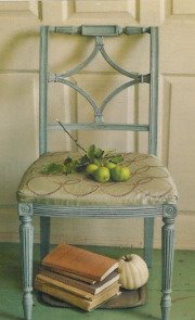
Seeing Jane's plate and reading her words, I was reminded of this chair I used in a recent post about fall, asters and the color purple. Meet Dahlia.

Deep purple velvet on the front and patterned velvet on the back. The colors of Jane's leaves and flowers well represented. Ivory-finished wood with a dark brown undercoat revealed by wear and distress. Curvy arms and back like the scalloped edge of Jane's plate.

As Jane wondered, so did I. Can a warm, fall-appropriate room be designed around these non-traditional colors? Let's see. . . from a plate, to a chair, to a room. . .

jane's plate


In this make-believe room full of unconventional fall color, a pair of Dahlias are joined by a mouse brown sofa with clean lines and a straight back. Flanking the sofa are tables with distressed ivory bases and dark stained tops. An antique bench brings more curves and a deeper version of yellow in its golden caramel, tufted leather upholstery. Underfoot is a green-gold area rug and across the room, to balance the weight of the large, dark sofa, is a large, dark sideboard. Two more tables, one dark and curvy, the other bright and sleek, round out my furniture choices. Accessories are a mix of contemporary—abstract art, light blue glass and golden ceramic table lamps, simple silk pillows—and traditional—French reproduction clock, blue Tiffany glass bowl, embroidered gold on blue lumbar pillow. I've imagined, and I'll ask you too as well, dark wood floors under everything and walls painted a pale straw gold. Arrangements of fall flowers and branches, like the one I show, will help carry the fall theme throughout.

But what about that big, blank surface in the middle of the room? What can I add to the brass and glass coffee table to suit the season? I like these dark turned candlesticks, below, and I'll use them as-is with ivory pillars. Of couse, they'll be joined by the requisite stack of art and design books and probably a very small arrangement of flowers or greenery.


To complete the vignette, and keeping our fall theme in mind, which of the four items below would you use? Clockwise from upper left: a trio of white glazed terracotta gourds, a rustic trug full of faux artichokes, antique hand-painted opaline glass vase, or the wooden duomo sculpture (but not the staircase as it's too tall and narrow like the candlesticks).

This room was designed without a client or budget in mind. It's a true mood board. . . a collection of ideals and suggestions put together to form a look, a direction, a "mood". Tell me where you think I've hit or missed. I appreciate your feedback.
And please remember to visit Jane's Apron. (written by Julie Thompson, not "Jane"). Lots of pretty, creative craftiness to see there.

Click on the mood board and go to my Polyvore page for items and sources used there. Dahlia chair from Horchow. Candlesticks are from Pottery Barn. Tabletop accessories are from, clockwise: Horchow, Pottery Barn, Horchow and Horchow.
***
OH NO!! I almost forgot to go to the party!! FLEA MARKET STYLE is hosting a McLinky party today—"I'm a Flea Marketeer"—and party-goers have been asked to show off their favorite flea market finds. I may be late, but my link is there—#102. Go to their post to see what my favorite find is and, while you're there, have a look at the others.
Lots of fun stuff to see!

Friday, October 16, 2009

A First. And Second. And Third.

In recent weeks (well, to be "honest", not really so recent), I received the HONEST SCRAP AWARD from three different blogger friends. My very first award! And while I did gratefully thank each immediately upon receipt, I have been remiss in acknowledging them here. In true pro procrastinator fashion, I meant to get to it right away... and then didn't.

So first off, I need to publicly thank these ladies for deeming me and my little blog worthy of their esteem: PK of Room Remix, Janet at The Gardeners Cottage, and Jill at Forever Cottage.

I was not familiar with this award so I googled it to find out what it means. Here's what I found: "This award is bestowed upon a fellow blogger whose blog content or design is, in the giver’s opinion, brilliant. This award is about bloggers who post from their heart, who oftentimes put their heart on display as they write from the depths of their soul."

Well now... I don't know about all that "depths of my heart and soul" stuff, or that there's anything close to brilliance going on here, but, frankly, I'm so impressed with each of the above blogs that it's quite something to have them notice mine and I really am flattered.

In order to officially accept this award, I have to follow a few rules:
1) Say thanks and give a link to the presenter of the award.
2) Share "10 Honest Things" about myself.
3) Present this award to 7 others whose blogs I find brilliant in content and/or design, or those who have encouraged me.
4) Tell those 7 people they've been awarded HONEST SCRAP and inform them of these guidelines in receiving.

Whew! Alright, I've taken care of #1; here's #2:

Ten Random Honest Things About Me
(prepare to be fascinated)

1) Quite often, I will catch myself unconsciously selecting a mug for my morning coffee that matches the pajamas I'm wearing.

2) While growing up here in Southern California, I lived within a bike ride's distance of both sets of grandparents' homes and only as an adult did I realize how fortunate that was.

3) I love to watch Ghost Hunters on SyFy by myself with (most of) the lights off and (all of) the doors locked (like that makes a difference to ghosts!) because it scares the you-know-what out of me. Watching it with someone else is a lot less spooky and even a little embarrassing.

4) I was so certain that my one and only baby would be a girl, I papered the nursery walls in pink and white plaid. Good thing I was right!

5) When I was in kindergarten, I was allowed to take the milk money all the way (probably 50 feet) to the grade school cafeteria and pick up the little cartons of milk for my class. I don't remember how many times or exactly how long my turn lasted, but when I think about it, I can still smell that cafeteria kitchen. It was a warm, sweet, delicious, fantastic scent. And I've never smelled anything just like it since.

6) My husband grew up in Massachusetts. I've known him for twenty years and I still get a kick out of his accent.

7) In a former career, I planned a corporate event that took place in Elvis Presley's Palm Springs getaway home. While there was not really much left of the King—framed artifacts here and there and the master bedroom was reportedly as it had been in his day—it was still a great location and a fantastic party (if I do say so myself).

8) I make a mean chicken pot pie... when I cook... which isn't all that often because...

9) ...my husband does 99% of the cooking in our house. It just sort of worked out that way and he's happy to do it so who am I to infringe upon his happiness, right?

10) For Halloween, when I was about twelve, I dressed as a box of Tide laundry detergent. That said a lot more about my future as a graphic designer than it did about my affinity for cleaning products or my latent housekeeping skills.

There you go! Ten new things you know about me!
To fulfill the last two requirements, I'm going to break the rules just a little. If I were to hand out seven of these awards myself, based on whose blog impresses and inspires me or to bloggers who have encouraged me in some way, I'd have to give it right back to those three who gave it to me. Obviously, and with good reason, they've already received it and as this award has been making the rounds like wildfire lately, the others I would choose may have also received it by now. So I am going to do this: encourage you to visit the following blogs to see why I think they are brilliant and inspiring and beautiful and fun to read.


I'm going to leave it up to these bloggers whether they choose to respond to this shout out as an "award" or simply as my sincere thanks for always entertaining, informing and inspiring me. If you're not familiar with them, go now and see what I'm talking about. Honestly, you'll be glad you did!

Wednesday, October 14, 2009

She Has Plans for You


Alexa Hampton, president of Mark Hampton LLC and designer of rooms like this (above and below)


furniture like this


lamps like this


and rugs like this


can currently be seen, and read, on the website of Williams-Sonoma Home. Their Designer Series, under the Design Center heading, features interviews with interior designers and style experts who offer practical tips and guidance to home decorators. In her piece, Ms. Hampton gives us tried and true, smart and sensible advice about planning and furnishing a room. Read it here—wshome.com


Once you've absorbed all that Ms. Hampton has to say, you might also want to see what others in the series have contributed. Tastemaker Carolyne Roehm talks about fabrics and color (of course color!) and design blogger extraordinaire Heather Clawson of Habitually Chic chats about the details and key elements that make a room work. And as long as you're already in the Design Center, take a look at the glossary of decor terms and play around with the upholstery design tools.


In her feature, Alexa Hampton says her favorite Williams-Sonoma piece is the Mark Desk (above). Chosen, she says, for its classic styling and the architectural feel of its stretcher base and column legs, this beautiful desk was actually designed by Alexa, manufactured by Hickory Chair, and named for her design legend father, the late Mark Hampton.

And because this is my blog, here's my favorite: the very feminine Carlyle Chair looking chic in ivory leather.


One more time, CLICK HERE to read Alexa Hampton on Creating a Furniture Plan at Williams-Sonoma Home.

Interior photos and Alexa Hampton portrait via Architectural Digest
Alexa Hampton furniture via Hickory Chair
Alexa Hampton lighting via Visual Comfort
Alexa Hampton rug via Stark Carpet
Williams-Sonoma furniture via wshome.com

Monday, October 12, 2009

Mood Board Monday... the pressure's on!


Two weeks ago, PK at Room Remix put forth a friendly challenge: design a room using one or both of the items you see above. On the left is a curtain panel from the very affordable collection at Pier 1. On the right, a medium weight trellis pattern fabric from fabric.com.

These are PK's "guidelines" (not "rules") of participation, paraphrased :
1) This is not a competition, but a fun way to see how many different results come from the same inspiration.
2) Use at least one of the inspiration items she has chosen.
3) Include sources and a brief description of the room.

So you see, the "pressure" I allude to in this post's title is not from PK, but entirely self-imposed. Not pressure to be the best or most creative, mind you, but pressure to simply show up. Making mood boards or presentation boards in a digital, virtual world is a skill I had not yet acquired when I accepted PK's challenge. I've made bunches of actual mood boards—for classes, for clients, for my own projects and just for fun—and knew that eventually, especially after I started my blog, I would need to know how to make this kind of board too. So I jumped feet first into Polyvore and after some fits and starts and a couple of shout outs for help from fellow bloggers, I present to you my first ever digital mood board (click on the board to get a bigger view) :

k's living room


College Girl Goes to Grad School is what I'm calling this project. My client is a young woman who has graduated college and moved into her first "grown up" apartment as she continues on to grad school and takes on her first post-degree, real world job. Yes, she's a hard-working adult now, but she's still very young and loves bright colors, fun patterns and a little bit of trendy mixed in with classics and investments. I chose to use both the curtain panels and the trellis fabric in College Girl's small living room. Around these inspiration items, the room has been furnished with affordable pieces that might be acquired all at once or a piece at a time over a period of many months.

THE DETAILS
Delilah Window Panel in Spring from Pier 1, $34.95 x 4 panels, $139.80
Linden Street Window Hardware in Black from JCPenney, $62.99
Trellis Fabric in Lime from fabric.com will be used to slipcover the pair of slipper chairs, $8.98/yd x 8 yds, $71.84 (+ sewing labor)
Deco Slipper Chair from modernfurniture.com. The included lumbar pillows will look great across the back of the sofa, $200.00 x 2, $400.00
Kramforss 2-Seater Sofa in White Leather from Ikea will serve our girl well for years to come, $879.00
Pharmacy Floor Lamp from Lamps Plus in black is a classic, $260.00
Gum Drop Table Lamp in Hot Pink from Walmart, $30.00
Damask Black Pedestal Coffee Table from Target stands in for the eventual purchase of an affordable Saarinen reproduction, $60.00
Trollsta Side Table from Ikea, $80.00
Island Sisal Rug from Crate and Barrel is basic and hard-wearing, a more colorful, even patterned, area rug can be layered on top if College Girl decides to go really crazy!, $399.00
Bird on a Wire Pillow in Spring Green from supermarkethq.com brightens the sofa, $24.00
Mongolian Sheepskin Pillow in Gray from pillowdecor.com is a splurge and will look great on one of the slipper chairs as a way to "unmatch" them, $100.00
Floor Mirror with ornate Antique Gold Frame will stand behind the slipper chairs, inherited from Grandma. Yay for "free"!
Bouquet on coffee table from The Boyfriend. Yay for generous boyfriends!
Art to hang over the fireplace mantel is a 30x40 photo enlargement on heavy-weight paper from wizardprints.com. The original art is a black and white print from a book of old engravings. Finished print will be mounted onto a blank canvas. Approximate price $100.00
Adrien Leather Ottoman in Fuchsia from Pierre Deux is the big splurge at $895.00. But it's so great looking and comes from a company that I love and, extra bonus, Pierre Deux (and their little sister company fclstyle.com which calls this piece Klismos on their website) will make a donation from each purchase in support of Breast Cancer Awareness Month. Here's what they say: "Make a style statement in support of a cause—$50 of each purchase of the Adrien (or Klismos) Ottoman in fuchsia will be donated to the American Cancer Society. A piece with extraordinary personality, it's the epitome of casual comfort to pull up for occasional seating, as a footrest or an extra surface. Artfully distressed semi-aniline leather upholsters a wood finish frame traced with natural brass nailheads and fitted with 8-way hand-tied springs." Who knows how many of these pricey little numbers they'll actually sell, but it's a nice gesture and a decent per-item donation. And it's a pretty fancy purchase for a girl who just graduated, I know. However, its classic styling and punchy color combined with multi-functional practicality makes it a nice investment piece for a young person just beginning to acquire fine furnishings.

The Grand Total: $3,500.00 and change plus some installation and sewing labor. Spread out over a bit of time and partially funded with graduation gift checks (!), it's an affordable, pretty room in which College Girl can continue to plan her bright future.

Questions? Comments? Critiques? Bring 'em on!
And be sure to go to Room Remix to see who else is playing "Mood Board Monday" today! Just click on the button below.


Credit should be given to Lauren of Pure Style Home for the photo enlargement source. See hers in her home tour here.
And BIG THANKS to PK for helping me get past my bout of blog funk with this fun challenge!

Wednesday, October 7, 2009

Seasons Change


While combing through tear sheet files in preparation for an upcoming post, I found an article pulled from a past issue of Country Living magazine. Titled "Get the Look Every Season", it's about transitioning your decor from spring/summer to fall/winter, or vice versa, using color, pattern and texture. I understand this colorful, traditional look might not be your particular style, but I assure you, these ideas can be applied to your home too. Imagine a softer pallette or more subdued patterns and solids, and you'll see.

Start with the basics. Good quality furniture in timeless styles, a neutral floor covering, and wall colors that work with both looks provide the backdrop on which to make changes. In this home, furnishings are a mix of new and antique pieces. Wood flooring throughout and a sisal carpet cut to fit the living room plus yellow walls in the living room and red in the dining room provide the basic foundation. Notice too that the bamboo blinds at the windows stay in place all year. Only the fabric curtain panels change with the seasons.


Find a good upholstery workroom. Or polish up your own home sewing skills. Slipcovers, pillow covers, tablecloths and curtain panels have the greatest impact when it's time to change seasons. Choose your fabrics wisely—mix patterns and colors to your liking or ask the advice of your upholsterer, the staff at a full service home decor fabric store (like Calico Corners) or consult with an interior decorator. Trims, buttons, fringe and other dressmaker details like piping, gathers and pleating, add to a custom look. And be sure to choose machine-washable, stain-resistant fabrics that will stand up to everyday wear and cleaning.


In the photo below, you'll see that white slipcovers are used on the sofa's seat cushion and the antique armchair. Checks and patterns inspired by the homeowner's collection of blue and white dinnerware and porcelain accessories, cover the rest of the sofa, ottoman, toss pillows and chairs that flank the fireplace. Similar red and white fabrics add to the mix livening the cool blues and complementing the yellow walls. At the top of this post and directly above, you see how the room has changed for fall. Slipcovers are removed to expose darker, richer fabrics and warmer textures on the upholstered pieces. Casual, summery tie-top window panels have been replaced by red, floral patterned ring-tops.


Accessorize for the season. It's likely that your spring/summer look will be lighter and brighter in both feel and color than your fall/winter room. Your accessories should be too. In these photos, below, you'll see that the dining room chandelier shades are changed from summery blue and white checks to black for fall and winter. Likewise, the plants and florals that were springy and fresh, have been swapped out for dried varieties and seasonal fruits. Branches full of fall leaves and piles of pinecones or seed pods would work just as well. In the living room, in addition to the changes you've already seen, an area rug in rich, warm colors is layered on top of the sisal that was left bare for summer. A few more pillows and a plaid throw cozy up the look even more.


We've been reading everywhere that changing our mantelscapes is a quick and easy way to update our decor to reflect the season. This room is no exception and you can see in the photos below how simple a change like this can be. The mirror, wooden box, hurricane and candlesticks holding white pillars remain exactly the same. Only the florals are different: a potted orchid and cut flowers from the garden have made way for a bright red seasonal bouquet and rosemary topiary. Look a little further and you'll see that the sunflowers that filled the firebox and books stacked on the hearth in summer have also been replaced. Fall brings out the firewood, tools and screen that make it possible to light a warm, welcoming fire.

Convenient storage makes it easy. At the end of the season, when it's time for a transition, this homeowner finds most of the pieces she needs right here in the room. A skirted round table hides a storage cart, see below, that holds all of the fabric items: slipcovers, pillow covers, tablecloths and curtains. For summer, the area rug is rolled up and stored under the sofa. And the article doesn't say so, but it's entirely possible the the chandelier shades not in use are stored right there in the dining room's corner cupboard.


Details you may have missed: Most of the art used here is black and white photography, all framed in black for a consistent, season-spanning look. Black ladder back chairs in the dining room are given off-white slipcovers to cool and brighten the look for summer. Warm yellows and reds are predominate in both rooms all year round while the cool blues used in spring and summer virtually disappear for fall and winter. The tray on the ottoman appears to hold the same stacks of books and magazines and the same silver dish in both seasons. What changes is the textile under the dish—lacey and white in summer, dark and homespun in fall—and the contents—fresh green limes change to golden apples. So easy.

Every time I see this article in my files, I think about whether or not I'd be willing to go to such lengths to change my decor for the seasons. I always buy a new pillow or change a couple of covers when the season changes. I've even been known to switch a blue and white throw for a solid white or warm gold. And of course I change certain accessories: seashells get put away for fall, plants and florals follow the seasons and books piled on the coffee table feature appropriate themes and subjects. But change the upholstery? The rug? The curtains? Sure, why not! I never seem to find the time though to do more than think about it.

What changes with the seasons in your home? Major pieces like upholstery and rugs or accessories only? What do you think about changing your entire look the way this homeowner has done? Easy and practical or too much trouble? I'd love to hear from you.
Country Living article written by Anna Kasabian. Photos by Keith Scott Morton. Interior design by Matthew Patrick Smyth.