 Allow me to introduce the Bailey Coffee Table.
 I have never loved a coffee table like I love this coffee table. But until quite recently, I've expressed my love from afar. At first glance—as seen in a Pottery Barn catalog two years ago? a year and a half?—I was drawn to its warm color and those pretty curves. I could see immediately that it was the perfect size and shape to replace the table I'd tired of—a relic from my husband's oak-dominated past. A perfectly serviceable table to be sure, but not nearly as special as Bailey. I've gazed longingly at Bailey both online and in many subsequent catalogs. Sadly, the original price prevented me from acting on that love. So I avoided looking for Bailey during outings to the PB store. I tried to pretend I'd never noticed it in the first place. That strategy almost worked.

If you've read my blog for more than five minutes, it's pretty easy to tell that I. Love. Color. Lots of color. Pattern too. One of my favorite rooms ever is this one, above, by L.A.-based designer Lynn von Kersting. Here, she mixes my favorite primary colors with vintage finds, Asian, European and otherwise exotic accessories and textiles, warm woods and worn painted finishes, all in a way that makes this room irresistible to me. Just look at all the patterns on those toss pillows on top of a patterned sofa! A green shade on a blue and white porcelain lamp? Yes please. Books and artifacts strewn about. Paintings hung like they've been collected over time. I could live here quite happily without changing one single thing. (Ok, I'd have to change out those white lilies for something else. Roses maybe. Lilies make me sneeze.)

Another designer whose colorful works I admire is Linda Applewhite who currently divides her time working for clients in both the Bay Area of Northern California and Santa Fe, New Mexico. These two living areas,
above and below, make me so happy. Again, look at all that color! I love the way she combines contemporary fabrics and patterns with antique furnishings and found objects with lots of authentic patina. Her rooms are often whimsical and a little over the top—even for me!—but I really appreciate her process. While they might appear to be mixed and matched with abandon, her interiors are very well-planned, well-balanced and super functional.

In my attempts to achieve a similar look for my own home, I've borrowed ideas from both von Kersting and Applewhite, while striving to stay true to the objects and shapes and colors and patterns I am naturally drawn to. Trying to do what's best for this particular house. And without tossing everything I've had and enjoyed for many years. I'll admit the idea of trashing it all and starting over from scratch has crossed my mind. But my practical side would never allow it. I also try not to have anything in my home just because I think it "should" be there according to the latest trends or design standards. And I want the things in my home to have value beyond their worth in dollars. Whether there's a sentimental attachment or just because it makes me smile, every object should have function or beauty—or both—in a way that appeals to the people who live here. (Lucky for me, my husband likes lots of color too, though he has occasionally expressed a fear of living in what he calls a "clown house"—too much of all the aforementioned pattern and color and exuberance. I tell him not to worry, but I can see that he sometimes still does. Not that I blame him... but I digress.)

A handful of detail photos,
above and below, give you a peek into my living room. Above: lots of mixed up pillows on an off-white sectional that more or less matches the cottage white walls; the patterned shade of the floor lamp that sits next to my red arm chair; golden checked curtains that give the room a beautiful glow at certain times of the day; a wool area rug that pulls together all the colors of the room. Below: my freshly painted green chair sits next to an antique oak secretary; vintage art and imported plates hang over the sofa; an antique oak table with pretty turned legs and carvings holds a few pieces of blue and white porcelain; the view over my current coffee table ends with the entertainment armoire across the room.

Easy to imagine—isn't it?—that a green coffee table would fit right in. And still, I couldn't justify the purchase. Several months ago, Bailey appeared in the back of the catalog with the clearance items. At exactly a time when I should
not be considering new furniture (bad economy=fewer discretionary dollars, especially when you already
have a coffee table). So I forgot about it. It obviously wasn't meant to be. And then. . . last weekend. . . I walked into the nearby Pottery Barn Outlet store. Right there, smack in the middle of the store.
Bailey.

Priced to sell at $249. And I can tell you, one would have sold right that instant and driven home with me if it weren't for this:
all outlet furniture sales are final. OH. NO. What do I do now? I thought Bailey was out of my life. I was prepared to live with old oak for the indeterminable future. So I did all that I could do. I looked. And touched. I may have even hugged it. I whipped my fabric swatches out of my purse to see if they liked Bailey too. They did. I snapped a couple of pics with my phone. Measured. Paced. And left the store. At home, I paced some more. Uploaded the photos. Looked at my room from every angle. Talked myself out of it. Then back in.
Here's a sketch of my living room. All of the case goods, with the exception of that green chair that might end up in the kitchen, are
brown. Oak, walnut, other woods I can't identify. Do I want to bring a green-painted coffee table into the middle? Will it stand out too much? Or will it blend nicely into the mix? It would sit on top of the red area rug, so the contrast there is low with regard to
shade, but high with regard to
hue—red and green being complimentary as they are.

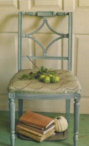
To make it even more confusing, check out this photo,
below. See the beautiful finish and how it's distressed and chippy? See the brown that shows through? Does that help it to coordinate? Or make it stand out in a way that's not good? What would Lynn and Linda do? Why is this
so hard??!! Because I want it so much? Or because it's all wrong?

When I called this post "a love story", I didn't say there would be a happy ending. I can't tell you yet where it's going to go. But I may not have much time. There were only three (or four?) on the floor so I need to decide soon. $249 is not a lot of money for a great piece of furniture, but it's too much money to waste on a coffee table that doesn't love me (I mean, my house) as much as I love it. And I need to get my life back and quit obsessing over this table! I do have other things to think about. Really. So I'm asking all of you. Bailey or no Bailey? Be honest. But not brutal. Remember, I'm in love. If it's not going to work, please let me down easy. Here. Have one last good look and let me know what you think. Thanks.

EDITED TO ADD: Check out my next post to read how this story ends. . .

 I'm currently working with a client whose built-in, family room bookcases need a makeover. Her exisiting situation is something like the pic you see above. Warm golden wood, closed cabinets on the bottom, open shelves up top. She wishes to play down the large expanse of wood—the floor-to-ceiling bookcases fill more than 20 linear feet of wall space, wrapping from one wall around the corner and onto another. One of the options I suggested is to add color or pattern in the form of paint, fabric or paper to the backs of the cases.


 ...including chalkboard paint behind shelves in a kitchen...


 ...to bold and bright.


