Showing posts with label art. Show all posts

Wednesday, July 14, 2010

Artist in Residence

Late one recent evening, my husband and I arrived home from a party to find an artist busily at work in our kitchen. Painting this as a gift for a friend:

She had been inspired by this vintage motto print I keep on a bookshelf:


She believed both the sentiment and the peacock motif would please her friend. Unable to get her hands on another—it's dated '1923' for heaven's sake—she set out to paint her own version. In a slightly different, more youthful colorway. A bit larger than the original too so that it would fit into the thrifted frame she intended to use. It has just the right amounts of age and patina.

I think her friend is one lucky birthday girl, don't you?

At the same time and place she found the gold frame for her friend, she also found this carved wood one for herself. In which to showcase a favorite greeting card.


Talented, smart and industrious. Creative, thoughtful and thrifty. Respectful of the old yet intrigued by the new. Beautiful too, as you can see in the self-portrait she drew for me, below. That's my girl. The artist.

[click to enlarge, if you like]

Oh, and that gorgeous frame I propped in front of her drawing? She thrifted that too. Add 'good eye' and 'excellent taste' to the above list.

Wednesday, July 7, 2010

New Art Arrangement Over My Sofa

This vintage print has hung over my living room sofa for about a year now. I found it in an antiques and collectibles co-op in Bakersfield, CA that occupies an old Woolworth's department store—a great place worth visiting if you ever find yourself in that neck of the woods. You can spend hours shopping for treasures on multiple floors then replenish your energy with a burger and a milkshake at the original luncheonette counter!


I actually passed on the print when I first spotted it because I already had so much set aside to buy. But it was one of those things I thought about for the next few days after I got back home. That's happened to you too, right? So, knowing my mom would be in the area again within the week, I asked her to pick it up for me—fingers crossed that it would still be there. Happily, it was and it's lived somewhere in my living room ever since. I really, really love it—the colors, the subject matter, that great frame— but at 34"x24" I've always known it was too small to hang over the sofa by itself. Because I wanted it there anyway, I hung two creamy decorative plates one above the other to the right of the print to create an arrangement with more weight. It looked forced and just not right. What to do? Ignore it of course! Until one day last week when I couldn't stand it any longer and decided to dig through my inspiration files.


A gallery or salon style arrangement is what I really wanted. Something along the lines of the one above from southernliving.com or the one below from gaitaninteriors.com. See how much space they fill over these sofas? Linda Crisolo, Marketing Director of Art.com says we should "make sure artwork is at least two-thirds the size of the sofa. For example, a 9-foot-long sofa should have a 6-foot-wide expanse of art above it." My 34" wide print was barely filling one third of my almost eight-foot wide sectional.


When it comes to salon style art, I am drawn to a looser arrangement of prints like those seen above. You may prefer a tighter, more controlled arrangement like the one below I found on Martha Stewart's website. I do have one small bone to pick with Martha, however, and I'll turn again to Linda Crisolo of Art.com to explain what that is: "People have a tendency to hang art too high," says Linda "The center of the image should be at eye level. In living rooms, people are usually sitting, so artwork should be lower. A good way to ensure you're placing artwork at the right height is to hang it one hand width above the sofa". Sorry, Martha. There are too many hands between your sofa and your art. It certainly is expertly aligned though.


Speaking of alignment, here's a look I love, from Traditional Home magazine, that is absolutely wrong for my room. Black and white photos of trees hung on a tight grid fill the space over this sofa—side to side as well as from just above the sofa to very near the ceiling; fifteen individual pieces reading as one large work of art. Beautiful, quiet symmetry. Inspiration photos can sometimes show you what won't work in your space as much as what might and, as I mentioned, I like things a little more mixed-up and colorful than this.


Now, here's some great color! Gorgeous panels that, again, completely fill the available space, below. Love the furniture, love the tablescape, LOVE the art and color story, but there's still something here that's not quite "me". Maybe "me" in a different kind of house, but not in this cottagey little ranch-ette I'm living in.


Aha! Now this one, below, is definitely me! This page torn from one of last year's Better Homes and Gardens speaks to me, first, because I am a complete sucker for striped walls (never mind that there is not one striped wall in my home) and, second, because I love the mix of vintage-looking art and colors and the variety of frame shapes and sizes. I also like the use of dimensional objects such as the plates and vase. But I already have a wall-mounted lamp on my wall so I'll reject the idea of dimensional art while I embrace the use of multiple colors, a vintage feel and subjects found in nature.


Inspiration image in mind, I poked around in closets and under beds for art to buddy-up with my favorite print from Woolworth's. Here's what I came up with:


The lighting is a little dim in this room even on the brightest day, and lately we've been having a lot of gloomy ones, so please bear with my amateur skills. Natural light photos without the lamps lit gave me the best results. And besides, my million-year-old sofa would rather be captured in low light and fuzzy focus anyway, thankyouverymuch. Looks good from back here, doesn't she? Especially with all her pretty mixed-up pillows acting as distractions.


I found a nice mix of frames to complement my centerpiece: a green one, a black one, a little gold one and two distressed white ones. The subjects too complement the central landscape: one vintage botanical greeting card, a floral watercolor, two bird prints and one seaside painting on a postcard. The mix of colors and styles feels just right.


I purposefully placed the arrangement slightly off-center above the sofa and closer to the table lamp than to the wall lamp because I didn't want the wall fixture to appear as part of the group. Placed this way, the grouping also hangs more toward the center of the room which is most pleasing when this wall is viewed from adjacent rooms. Long explanation shortened: it just looks better that way!


See that light fixture on the wall up there? That's my solution to lighting over the corner of the sectional. I didn't want to place a table or a floor lamp behind/beside the sofa, so we mounted an old yard sale find on the wall. Its twin lives on the same wall at the other end of the room. Lit at the same time, they help fill the room with light when we have a crowd. This one lit by itself provides just the right light for reading (and blogging) when I'm tucked up into the corner of the sofa.


Gallery and salon style arrangements are not new to my house. I've always enjoyed massing art and objects together—sometimes a little too much. Sometimes to the point that I tire right away of the visual "clutter" and have to take everything down and start over. More than once on the same day I put it all up! This wall though seems quieter to me than other arrangements I've put together. That it's been up for almost a week and not one thing about it "bothers" me when I pass through this room tells me that it might be here to stay a while. At least I hope so. I have too many other unfinished projects to attend to. . .

Monday, June 28, 2010

The Softer Side of Outdoor Decor

"Mom. Look at this picture."

"Oh! Look how cute you all are! Where is this? Santa Cruz?"

"Yeah. We were walking down to the beach."


"You have such a beautiful smile. I wish you'd stand up straight though."

"Mom. Stop it. Didn't you notice the tree?"

"What? Oh! Why is that there?"

"Somebody just did it. Isn't it cool? It's called 'urban knitting'. Here, look at these..."


"Wow. That's, um, very interesting. They do that without permission? Like tagging? I guess it's better than spray-painted graffitti. Will it hurt the trees?"

"Oh my god, Mom. No, I don't think so. It's just supposed to be pretty."

"Well, it is that. Where did you find these?"

"Here. And here."

"Can I blog this? Can I use your picture?"

"Sure."

Tuesday, June 22, 2010

Pretty Things from the Sea


I spied these unique, sea-inspired accessories in a catalog that I had never seen before and was intrigued enough to share them with you.


What do you think? Sea anything you like?

Sunday, May 16, 2010

Books and Chairs : Two Great Things that Look Great Together


Chairs. Love them.


Books. Can't live without them.


Put the two together in a beautifully styled photograph in your glossy book or magazine and you'll stop me in my tracks.


I know. It's weird that I should have such an affinity for these images that I've torn more than a few from magazines and saved so many others to my photo files. I've also made note of several artists, kindred spirits perhaps, who have actually taken the time to paint books on chairs.

Vincent Van Gogh painted his friend Paul Gauguin's chair in 1888 while they stayed together in the yellow house in Arles.


Contemporary artist Maira Kalman painted a chair with books in her uniquely charming fashion. Perhaps this one is in her own book. I would love to get my hands on a copy and find out for sure.

WordWeaverArt, an etsy artist, titled this work "Comfort" because it recalls the feeling aroused by the image on a cherished greeting card. Comfort. I imagine that's exactly what books and chairs are all about for me too.

My freakish obsession led to my own photographic efforts...


What do you think?
Should I see someone about this?


Chair photos culled from unrecorded magazine sources except for the white chair draped in pretty scarves and equally pretty pink phone. That one I found on Flickr, here.

Friday, May 14, 2010

Other Ways to Decorate with Books


In my last post about backing your bookcase, you saw books in their natural environment. Lined up, stacked, contained and confined. That doesn't sound so great though, does it? If you love your books as much as I love mine, spread some of them around. Let them have some fun! These books, above and below, get to welcome your guests and roll around on a tea cart.

[Better Homes & Gardens]

These get to stack up with a bunch of their buddies on a pretty purple table. Notice how some are acting as risers to show off accessories and lend dimension to the tabletop display. Books, like dogs, are happiest when they have a job to do.

[Elle Decor]


Here, a few carefully-coordinated volumes support a beautiful arrangement of flowers so that it's not overshadowed by the drama of the shell-framed mirror.

[Lynn Von Kersting via BH&G]

Also in an important supporting role, the books on the left-hand bedside table lift the lamp to the same height as the one to the right. Think about this next time you use mismatched tables—or mismatched lamps—beside your bed or sofa. Keep your lampshades lined up. Books love to help.

[Southern Living]

When you've run out of conventional storage space, as Joni did, pile your books on a table, stack them in baskets, add a collection of objects and your overflow becomes artful arrangement. No one needs to know that you've simply bought way too many books!

[Cote de Texas]

A single, beautiful book becomes art itself. Albertus Seba's Cabinet of Natural Curiosities, below, has been the center of attention on countless coffee tables. No doubt the other books are jealous, but some are just born to be stars.

[Kendall Wilkinson via OKL]

Other books enjoy being members of the ensemble. In this display, below, colorful books arranged facing forward on ledges take the place of artwork above the sofa.

[Pottery Barn]


High above the sofa—and everything else!—these brave books line up on shelves built over the windows just for them. How will they ever get down? Your guess is as good as mine.

[Apartment Therapy]


At the opposite end of the wall, way down at kid level, the books below are displayed on an old-fashioned plate rack, making them easy for little hands to grab at story time. Plus, their attractive covers make great art in your child's room.

[Martha Stewart Living]

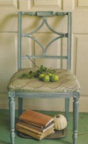
All the way down on the floor now, a graduated stack of books becomes a table. This is the perfect job for those over-sized volumes that don't easily fit into bookcases. A tip: don't put much on top of that stack in the way of accessories. It's not the most stable surface after all. Do leave room for your cup of tea and a small plate so you can have a snack while curled up in the adjacent chair. Reading, of course, yet another book.

[Real Simple]

The ultimate in "books as decor"—a dedicated library. This one was created from an under-used dining room. A terrific idea, I think. On most days this room serves as reading, research and storage space. Then, imagine how cozy it would be to dine by candlelight among the textures and colors and countless stories contained within your collection of books.

[Cottage Living]

If you're interested in learning more about decorating with books, here's a book named just that. I don't have this one myself, surprising considering how much I love both decorating and books. I have peeked into it at the bookstore, however, and it probably will come home with me sometime soon. Because you really can never have too many books. Even books about books.

Sunday, May 9, 2010

Happy Mother's Day


to my mom, to your mom,
to you and to me.

I know you have seen this painting in a variety of forms, probably hundreds of times. Reproduced not only as a print, but on mugs and postcards and magnets. It is one of those images that is so ubiquitous it runs the risk of being looked upon as trite or cliché. To see it in person though, as I have recently, is to have an entirely different experience with it. To see it in person is to understand why it would become one of our most enduring images of mother and child. It is gorgeous and glowing, simple yet profound; quietly speaking volumes about a perfect moment in an ordinary day. I wish you all such an ordinary moment on this perfectly beautiful spring day.

"Breakfast in Bed", 1897, by Mary Cassatt is on permanent display in the Virginia Steele Scott Galleries at The Huntington Library.