Fresh from my visit to the 2010 Pasadena Showcase House of Design, here is what I learned...

1. I can love a really large space and a really small space for exactly the same reasons. The Drawing Room, above, and Retreat, below, shared the following: honey-toned panelled woods, decorative ceilings (one painted, one panelled), beautiful overhead lighting (a pair of antique reproduction chandeliers in one room, a single Fortuny pendant in the other), furniture that actually looked comfortable and not just set out for show, and direct access to the outdoors. That I could be equally happy and at ease in each space says something about my personal preferences but is also a credit to the designers who made them both so approachable, functional and warm despite the challenge of size.

2. It really is the details that make the difference when it comes to good design. All through the house, the things I took note of had less to do with the overall look of a room than with a specific detail that could be reproduced in a room of any size and at nearly all price points. For example, the double ruffle on the top edge of a sheer, fixed, shirred curtain panel hung for privacy at the lower half of a very tall window. The narrow ribbon edging each of those ruffles was a slightly darker tone that added a dressed-up crispness to an otherwise nondescript window treatment.
3. It is very frustrating trying to recount such details about the show house when no photography is allowed. Can anyone explain to me why that is?
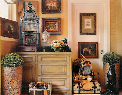
Like multiple dog prints on the mudroom walls, above. A row of potted succulents lined up down the center of a table or winding through a rose garden. Books with similar colored bindings massed into a bookcase of nearly the same hue can unite and "neutralize" a large wall of built-ins; what could have been chaotic visual noise became a calm but still interesting background.
5. In a residence of 50 rooms, there are a lot of redundant spaces. Morning Room, Breakfast Room plus a table and chairs within the kitchen itself. Three Sitting Rooms and a Drawing Room, also for sitting. Solarium on the first floor, Sun Room on the second. You must be very clear about which bedroom you say you'll take your breakfast in when there are eleven of them. I have decided that I am very happy not to have this particular problem. But, for the record, as I don't have one now, I wouldn't mind a private Sun Room next to my bedroom. Or an upstairs Retreat with connected balcony. Or both.
6. I am too traditional to enjoy juxtaposition simply for the sake of it. The Cravens Estate is a beautiful house built in 1930 with elements borrowed from a classic French chateau. Original details still present include a series of large murals in the entry. For the Showcase, the murals were preserved and restored. Then the designer of the space added these:
<>

An ultra-modern, glossy black totem, a space-dominating black console down the center of the room, lime-colored accents and upholstery, and a black Lalanne-esque sheep the docent called "Tommy". It was all a bit too much for me. What do you think?
....
7. I may be traditional, but I do love an eclectic mix of styles and colors. The large, formal dining room with its original murals and painted ceiling was furnished with two round tables rather than the more expected long rectangle. It appeared as if the guests had momentarily stepped away from a lavish birthday party in progress. Seating was a mish-mash of brightly upholstered chairs and an ottoman or two. Even the mix of lighting styles is appealing in this photo, below, but I swear those Ikea Maskros pendants were not in the room when I was. Could I have been so distracted by the party that I missed them? If they were removed, I wonder why?
<> 
8. There really is such a thing as too many crystal chandeliers. A narrow, lady's closet contained five. The connected dressing room, a few more in sconce form. The adjacent hallway, yet another. Too much, too many.

10. When dining out of doors, there should be plants to admire near the table as well as a mature garden in the distance (even if that distance is only twenty feet further away at the edge of your small yard). The outdoor dining area my friend and I enjoyed was bordered by a row of espaliered apple trees under-planted with colorful, textural ground covers and small border plants. Plants near the table add a closed-in coziness that alters your perspective of the surrounding garden; having something to look beyond makes the "beyond" appear further away than it is.

11. I discovered an interesting new-to-me way to achieve a unique display of art in your home. This bit of fun needs its own post. Stay tuned...

8. There really is such a thing as too many crystal chandeliers. A narrow, lady's closet contained five. The connected dressing room, a few more in sconce form. The adjacent hallway, yet another. Too much, too many.
9. I hope no client of mine ever wants to outfit her office with a desk chair straight out of an Austin Powers movie. The room below displayed a very creative mix of colors and textures, but I am not the person to call if this is your style. I know my limitations and exactly to whom I will refer you.

10. When dining out of doors, there should be plants to admire near the table as well as a mature garden in the distance (even if that distance is only twenty feet further away at the edge of your small yard). The outdoor dining area my friend and I enjoyed was bordered by a row of espaliered apple trees under-planted with colorful, textural ground covers and small border plants. Plants near the table add a closed-in coziness that alters your perspective of the surrounding garden; having something to look beyond makes the "beyond" appear further away than it is.

11. I discovered an interesting new-to-me way to achieve a unique display of art in your home. This bit of fun needs its own post. Stay tuned...
That's all I have to say for now about the Showcase House. Should you go? I can't really say. There was a lot to see, but I didn't like being herded through like cattle. The shops offered unique and beautiful things but were expensive for someone who doesn't drop two hundred bucks on jewelry and table linens without more than a few minutes' (or a few days') thought. The Wolfgang Puck dining experience was lovely but my quiche was under-cooked. The house itself with all of its original elements is gorgeous, some of the decorating decisions too "showhousey" (but that's to be expected). If you have a good friend to share the day and the drive with, as I did, you'll have a wonderful time even if you don't agree about the kitchen.
...
Cravens Estate rendering by Eva Margueriette.
All photos by Alexander Vertikoff from the official program.
No, I didn't talk about the kitchen in this post. There were simply too many contradictory ideas and treatments and I still can't make heads or tails of it. The nicest thing I can say is that my friend and I agreed that the restored, original turquoise tile floor was fantastic and the best element in the room.
Thanks for the day, Leslie!
If you want to get a look at the house yourself, go here.


8 comments:
We don't have "Show Houses" here in Australia. It was an interesting tour with you even without a glut of photos to see what you mean. They don't allow photography at trade shows here either and I am always too scared to be sneaky.
Sounds like you girls had a nice day anyway and sometimes it's more about the company than the event.
Jennifer XX
Hi Tracy,
It actually looks really pretty. I really love the dining room. And the outdoor area looks good too. I had made up my mind that I was not going, but now I'm thinking maybe? It is a fun day with a friend.
~janet
I love showcase houses. There's always at least one idea that you wished you'd thought of. I agree with you about picture #6. I don't mind the lime green chairs and totem (that's not a Louise Nevelson is it?) breaks the strong horizontal of the low paneling but I would have chosen something different to accomplish that. Maybe even a turquiose secretary would be kind of cool if you're going for strong color. Don't get the sheep either. Love the checkerboard pattern on the ceiling of the first photo. That's pretty cool.
Sounds fascinating - you noticed some great details and it does seem as if the house, overall, was anything but 'safe' !
Hmmmm, I don't 'likey' this. Too much stuff, gawdy, overdone? I have seen others I like more. It bothers me too when visiting these show homes that one cannot take pix...
xo
I really enjoy visiting showhouses too and most of the time I end up really liking parts of the home and wonder what they could have possibly been thinking in other parts. Since it's a showhouse I'm sure they like to push the envelope and are always trying to go for something unique and different but I think there's a line that gets crossed sometimes. It would be fun if they would allow photos, but they're very strict about that here too.
These designs have left me speechless. I won't be surprised if someone's office was inspired by these pictures. Personally, I like numbers 6 and 10. Especially 10, since I could really use its design for my own office.
Cool House Designs! I think I've finally found which design I should I use for my new home office. Thanks to you, I now have many choices. Personally I like number 7, because of its unique style.
Post a Comment