 In this post, the last one about the Pasadena Showcase House (I promise!), I attempt to illustrate a creative DIY art idea I saw on my recent tour...
 STEP ONE: Get your hands on a great big oil painting. Three feet wide, at least. This may require a visit to your local flea or antique market. This project works best with a landscape or cityscape, something with a lot going on and multiple small subjects rather than one central subject. Lots of lumpy bumpy paint texture is good too.

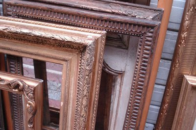
STEP TWO: Gather a bunch of random-sized picture frames. 8x10's to 16x20's and anything in between. A variety of sizes and frame styles is most ideal. If you're crafty enough, feel free to cut them up and reassemble your own custom sizes. Carved frames make the biggest impact but toss in a few plain ones to mix it up.
 STEP 3: Take that big painting out of its frame. Your plan is to cut it up into several smaller pieces. Your objective is to create something like this popular treatment...

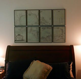
...where a large map is cut into sections, each section framed separately and hung in a tight grid...
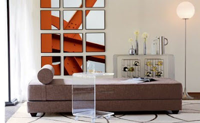
 ...or, like the treatment below which requires a large poster or photo enlargement and those square album cover frames. The only difference is that our disassembled and reassembled oil painting is more random.
 STEP 4: After you've cut your painting into pieces based on your frame sizes—or cut and resized your frames to match your painting sections, you decide which approach works best for you—paint all those frames the same color. A single frame color is important. It unifies the many pieces of your installation so that they read as one work of art. In the treatment I saw, the frames were painted a dark grey, a color pulled from the painting's moody streetscape. This is key to the look—that the frame color blends, does not contrast, with the colors in the painting.
 STEP 5: Now, get your cut-up painting pieces into those frames. I don't care how you do it—staples, tape, glue, whatever works best for the situation you have. Nobody's going to see the backs anyway so just make it work. Remember, this is a DIY project so I expect you to be a little bit handy before you even attempt it.
Note: If I'd been more stealthy, or less hurried by the surge of lookiloos coming up behind me, I would have thought to snap a forbidden cell phone pic. But I didn't. Instead, I've created this "virtual" version of the finished product...
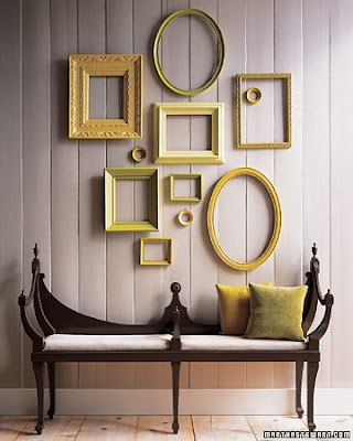
 STEP 6: Hang your new art! As you see in my virtual example above, the designer chose to overlap some of the frames onto the others. He actually used nine separately framed sections for his treatment so I'm sure it took some trial and error to get the layout just right. Please use you imagination to see the frames as all slightly different types and widths. At the show house, the wall behind the art was painted almost the same shade as the frames making the look all about texture and color and mood. The overall size of the arrangement was about 40"x30". If you don't like the overlapped look, try a tightly arranged collage or salon style like this...
 This is a pretty ambitious project, but really not so difficult, and I'd never seen anything quite like it before so I thought it worth sharing. If you're looking for a unique way to fill a large space, I think it's a great idea to file away for when the right situation and materials present themselves.
What do you think? Would you try it?

 Hope you moms out there enjoyed your day yesterday, because all too soon it's back to business as usual. Today is